
Hello everyone! Welcome back to the new and improved fortnightly URR blog update (for the time being, at least, though so far I can truthfully say that a slightly faster turnaround time has been only motivating, and not stressful – touch wood). Two entries ago I discussed in some detail the ongoing generation of the “poem” riddle archetype, which is going to the primary one for the forthcoming 0.11 release, and last entry I discussed the new tutorial system which’ll tell the player what they need to know and what they’re supposed to be doing, while also removing the old guidebook, making some big changes to the game’s control system, and also implementing an updated and polished options menu, which tracks which tutorials you’ve seen and whether or not you have tutorials enabled or not (definitely check that one out if you haven’t seen it!). This fortnight, then, we’re going back to notes – and also to books! – which will form some of the core foundations of the information you’ll be able to get in the game world. There has been a lot of progress on both of these, so let’s get into it.
First, I’ve begun some major new progress on books. I don’t anticipate books being open-able in 0.11 – but the exception here is the player’s journal. I think this’ll be an important piece of the game, and so I needed to get some of the basic implementations into the game for books in general, so that they can be used to handle the journal, even if all the other in-game books will be developed next year for 0.12. So, one of the first things I did was to return to the sketched-out version of books I had a few months ago and redevelop it away from placeholder / proof of concept, and towards something that any possible text can be put in, in a book of any size, and it’ll always be able to fit it in, as well as doing logical things like going to new lines or new pages for new chapters, and the like. This didn’t take too long since a lot of the foundational code was already there, but one of the really cool new additions I’ve worked on in these last few weeks is the ability to include pictures in books. There’s essentially two possible pictures we might want to appear on a given page of a book – a symbol (one of the several hundred strong library of 7×7 pictures I’ve developed, which I’ve shown a few of in recent entries) or an area of a map, either a global map or a local map, each tile of which is displayed 3×3 tiles in note form and I’ll be carrying that over to the books as well (so either 6×6, or 6×9, or 9×9 tiles in total). The game also has to be able to work out what image to print on what page, even though anything could be on any page, and we always need to make sure an image is being printed on the logical page, and to then bend the text around it – and do all of this when a book is generated so that the game can store page numbers, in case the game wants to use those in a generated riddle later on! So, for example, here are some book pages (using some placeholder text) of how we can fit pictures into book pages:
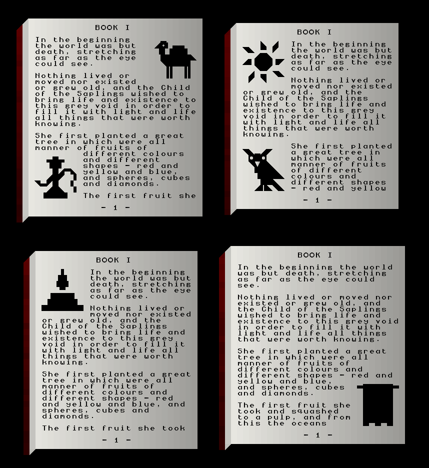
I think these give a really, really exciting glimpse into how finished books will wind up looking! Although I don’t anticipate symbols and pictures being everywhere, I actually do think that they are going to be a significant part of the books. Part of this decision is because I don’t think other games which procedurally generate books – which is not, er, exactly a lot of games – are really doing this, and it’ll be another intriguing and distinctive thing through which URR can stand out from the crowd. Far more practically though, it will aid in how readable they are and how accessible they are to players (particularly new players), and the integration and combination between visual aspects and written aspects will allow books to be both richer, and far more complex, sources of information. Pictures will also allow clues to specifically refer to pictures within certain books, and you will also notice that all these books also have page numbers at the bottom – I anticipate all books being created at world generation rather than on-the-fly throughout the game, and so some puzzles will will even be able to refer to particular numbers or particular pages in particular books! This stuff is so exciting. I mentioned above that it will also be possible for a map image to appear in a book – I’m still working on this at the moment, so we’ll show this off in another entry (it’s not quite as simple as just copying this code from other places where maps are used, but it’s not too far removed either, and shouldn’t take me too long to do, all things considered). These major steps of progress on generating and handling books are also the foundations for the journal – more on that soon!
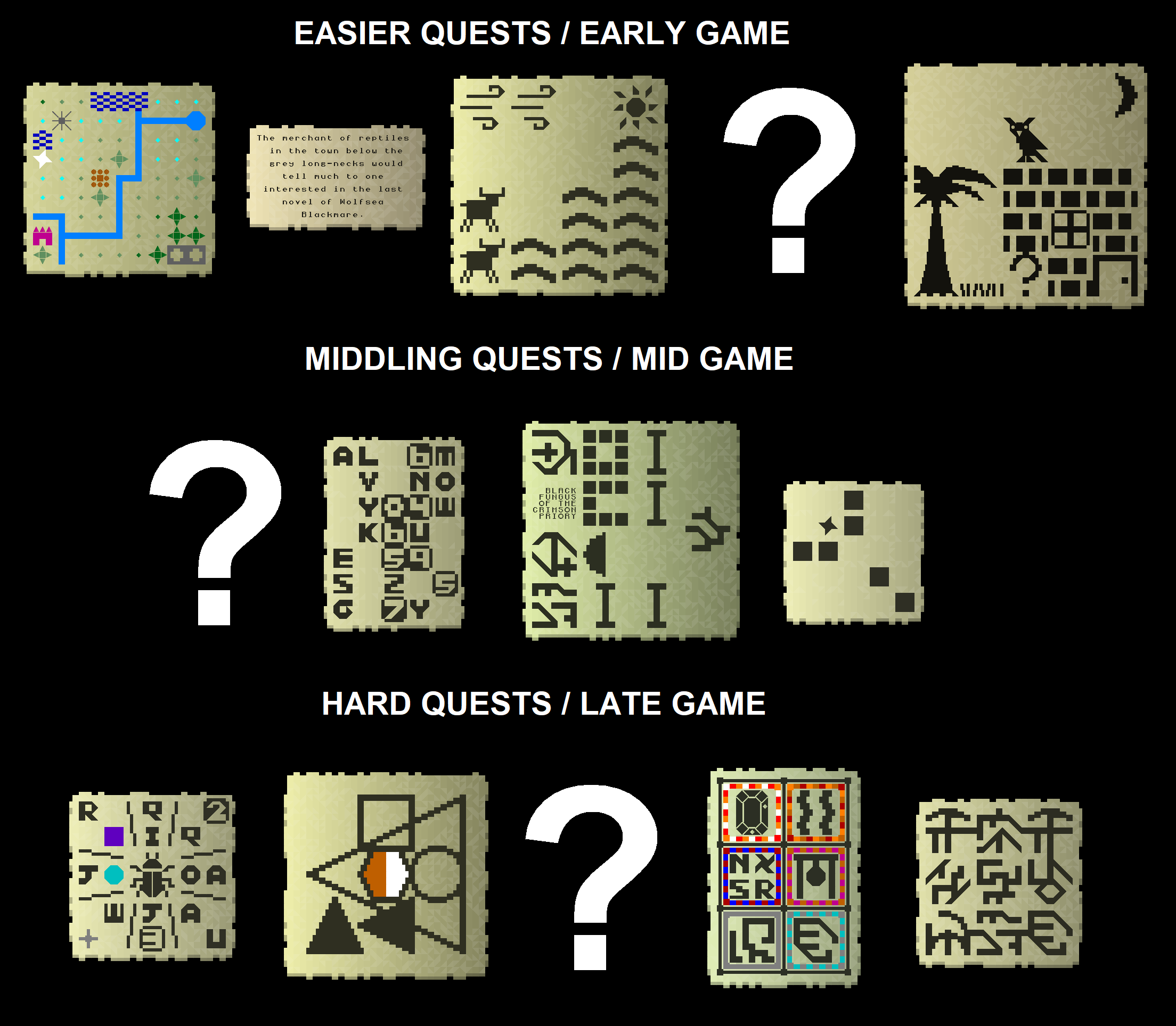
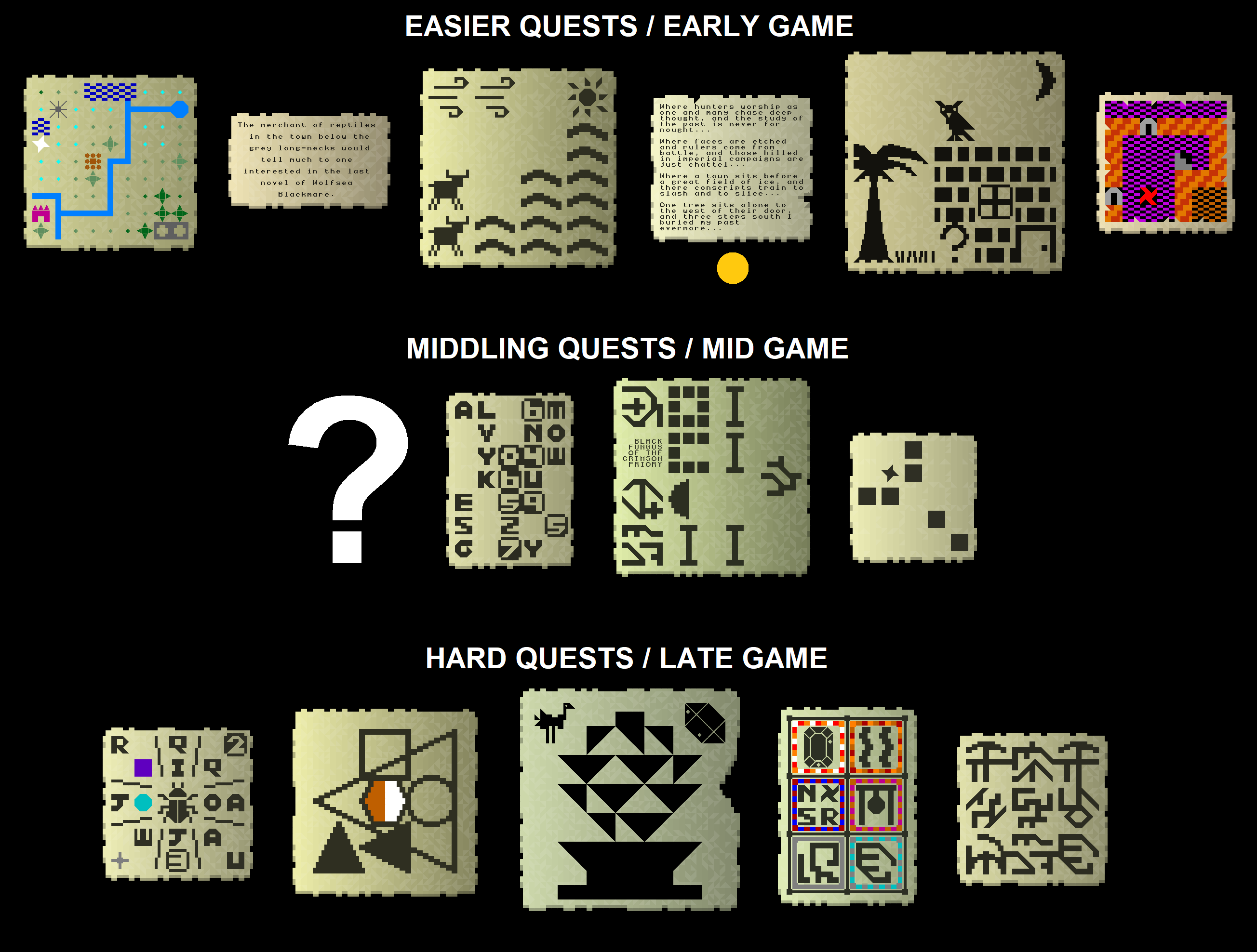
Next, let’s talk about notes. Readers might recall this image from two posts ago, in which I noted that it was becoming increasingly clear that different riddle types should be scaled according to different points in the game the player is at. We’ll be starting with more obvious and transparent clue types, such as those which imply an area, or depict a specific scene, or contain a map, or just up-front written information about something… and then as a playthrough progresses, information will become gradually more obscure, and gradually more obscured in nature, and increasingly abstract, and require more and more understanding of that particular game world and its nations, religions, histories, and so forth. This diagram also had three “?”s on it, to denote clue types I hadn’t shown off yet. The first of these – going in the top row – was the poetry archetype, which I did show off a month ago, and continue to work hard on for the 0.11 release (more on this soon). In the meantime, however, I’ve also begun to implement the generators for the other two new clue types – they might not find their way into 0.11, but working on the poetry generator is hard work (rewarding, but hard!) and I do need to work on other things from time to time as well. The middle one isn’t quite ready to show off yet – as the complexity of the clue does not correlate with the complexity of the clue generation, and indeed might actually inversely correlate with it, but that’s an interesting design discussion for another blog post – but the bottom one is coming along nicely.
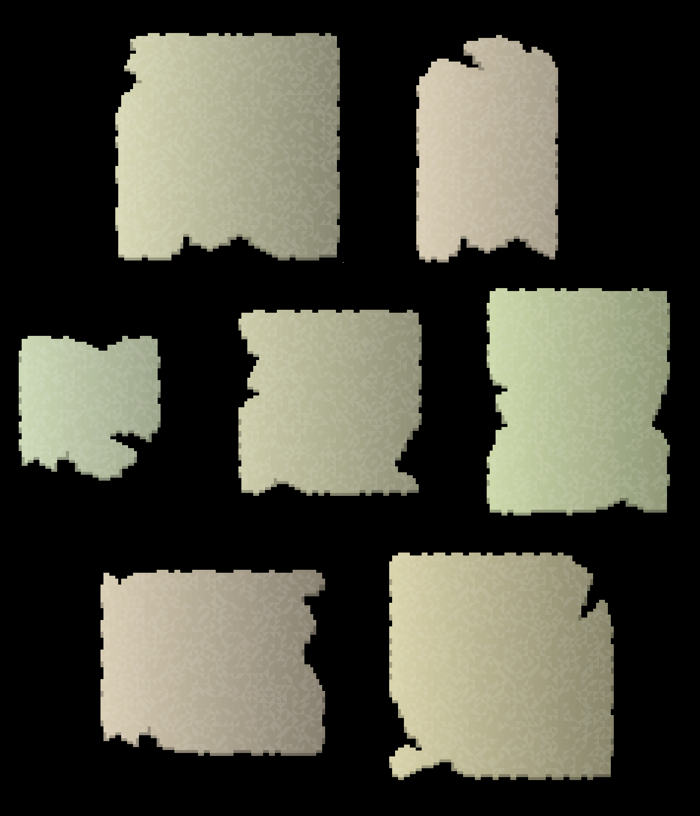
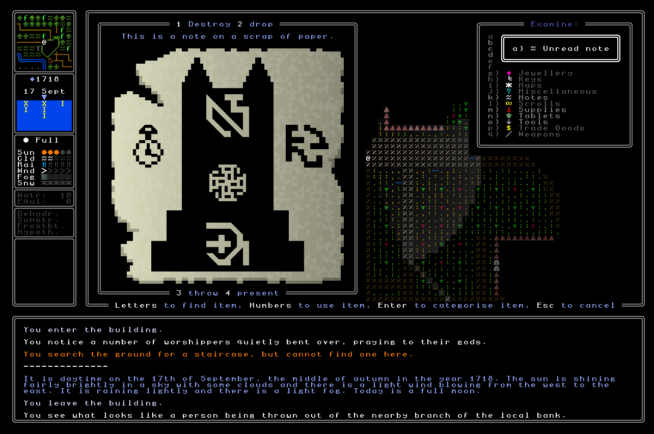
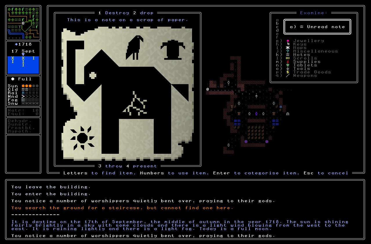
Before we get to that, though, we need to talk about damage! This fortnight I’ve gone back to notes and fully implemented the damage aesthetic that I talked about previously as being something I want to work in. For now, this is only aesthetic damage, i.e. it will never obscure something on the note that might be important, but later I have more ambitious ideas for this, i.e. damage which can obscure something on the note (the coding of this, to ensure the game knows what part is being obscured and has another method for the player to discover it, will be complex), and also for notes that are in two parts and have been torn in two, and you’re looking to spot the note fragments with the similar lines of tearing to put them together (or four, or six, or nine, and so on…!). Here are some examples of notes with generated damage, and note also that the game is also able to figure out where the thickness of the note should be applied – to imply 3D depth – and does this almost perfectly, though this is a complex thing and still needs a little bit of tweaking. Essentially damage can be applied to a corner or a side of a note, and the game tries a number of times to fit some damage in – the amount of damage being another variable I’ll be able to tweak, and will perhaps correlate with how old the note is? – using a large number of possible damage “shapes” which can also be rotated and inverted and so forth to fit them. Then, as I say, it cycles around the note to ensure the 3D effect is always correctly applied. Taking away the content of notes, then, this leaves us with something like this:
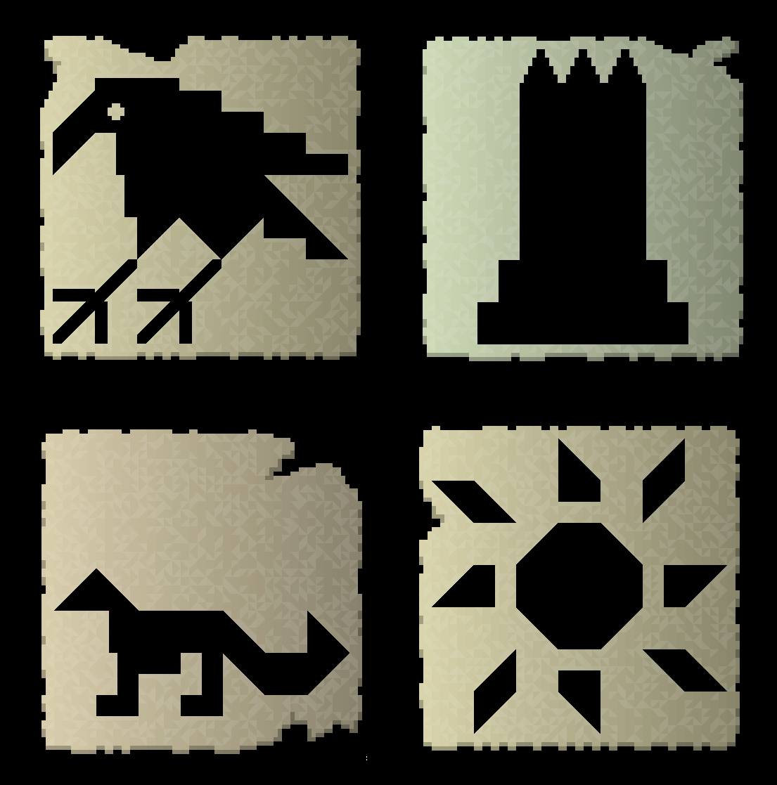
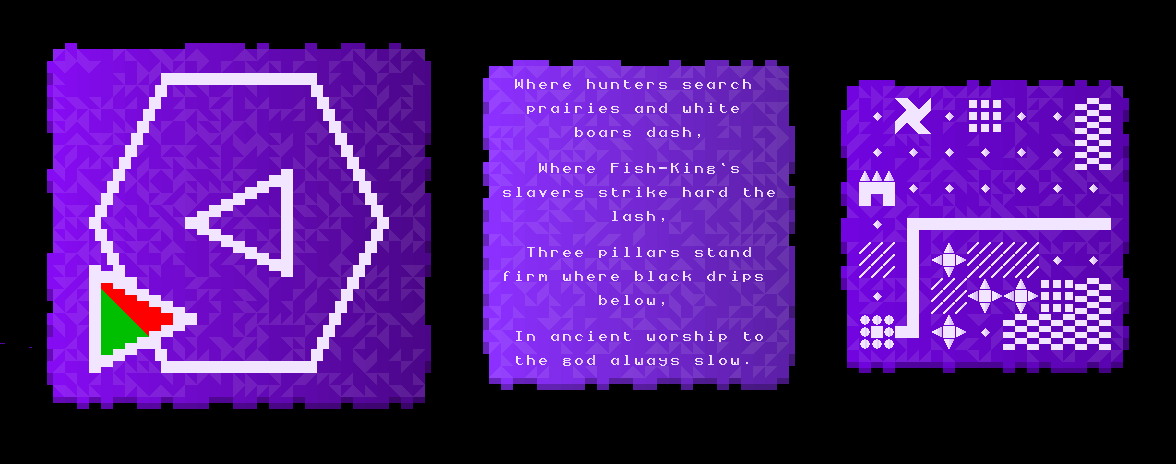
These make for vastly more organic-looking and realistic notes, and this then brings us nicely into the new clue type in the “hard quests / late game” category, which I think are very aesthetically pleasing. I’m calling these for now the “recursion” clues, and these involve one of the game’s many hundreds (647 and counting) of small 7×7 images – selected carefully to ensure the image actually has room to do the thing I’m about to ask it to do – blown up to 5x size (so becoming 35×35, which just fits into the largest possible note, with no space to spare!) and then serving as the backdrop for other images to be nestled within it. As with all the late-game clue archetype, the idea behind this one is to convey to the player a set of abstract relationships they might not previously be familiar with, and which might be useful to consider, or might give an answer to another clue, or suggest an interpretation that would lead the player somewhere, or fill in the gap in understanding something which relates to another quest… and so on. I’m really happy with how these are looking, and again I think they’re very distinctive and unlike the other clue archetypes or categories, and also give a huge amount of potential for what these could be used for during later game quests. Essentially, this clue type selects something which is the “topic” – rather like the example in the big picture in the bottom left, the “focus” or “centre” type, in that example shown with a scarab – and then finds room in the image to print a bunch of other symbols in it, which will all be related to it somehow. For starters, then, I needed to enable the game to be able to expand any of the 7×7 images up to 35×35 and then print them onto a note, and that gave us the following:
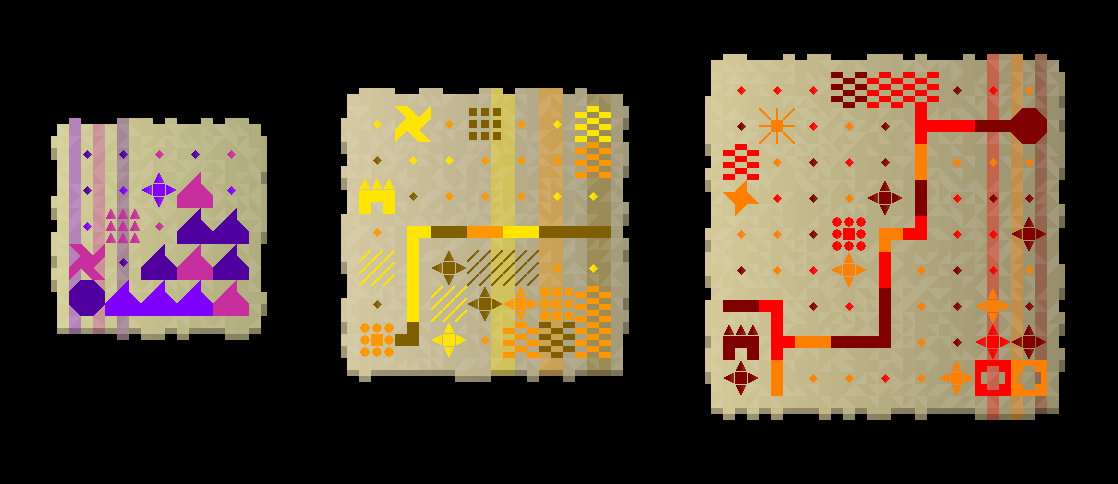
This is just the first stage however, since right now these show no interaction or association with other symbols or other pieces of the game world, and so more needs to be added in order to flesh these out into a fully-developed clue type. Specifically, what this means is that the game then looks in this picture for places it might be able to fit a smaller version of other pictures, whether they’re also black on the background of the paper colour, or whether they’re paper colour with a black background. To explain what I mean by this, here are some diagrams. Each expanded tile in one of these pictures is 5 by 5 characters, so two next to each other would be 10 by 5, and four in a square would be 10 by 10. This means a 10 by 10 square can fit in one 7 by 7 smaller picture, and to visualise what I mean by this, here’s an example of one of the potential crown shapes, where I’ve used dots to highlight a grid location where there’s nothing, as either complete black or completely blank. As you can see by looking at the fourth column or the sixth row, as I say, these are these are expansions of a 7 by 7 picture onto the full size of a note, on which we are now trying to fit smaller pictures in order to denote some association between multiple smaller pictures and the bigger picture which forms the basis of the note. I feel this is dreadfully confusing even now I’ve typed it out, so again, let’s get some visuals.
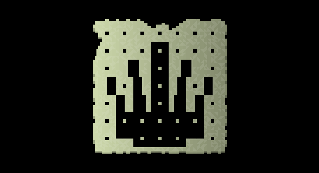
In the above picture then, we can see how the image consists of 7 by 7 “tiles” and each one has contributed to constructing this overall image of one of the possible in-game crown shapes. Now the game needs to look for places where other smaller images – in the normal 7 by 7 size – can fit in. This means it needs to locate a 2 by 2 area where it is all black, or all paper, in which it could then be slotted (because 7×7 is smaller than 10×10). This was a surprisingly complex bit of code to write because of how the images in general are handled and generated, but after a little bit of thought I came out with something like this:
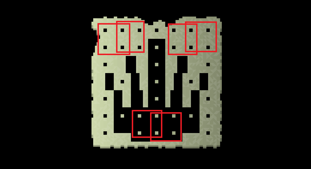
So we can see here that six potential locations exist to put in a 7 by 7 symbol of some sort – two in the top left, two in the top right, and two down at the bottom. If they were to be put in the top left or the top right they would have black ink on the paper coloured background, but if they went down at the bottom, they would of course have the black ink as the background and the paper colour as the foreground. This is fine, except that one obvious issue arises here which is that some of these 10 by 10 grids overlap, and we obviously don’t want any of the 7 by 7 pictures being put into those 10 by 10 grids to overlap. So, the game also looks for for for larger blocks of space in which something could be printed on the same note, and for this particular image this would look something like this:
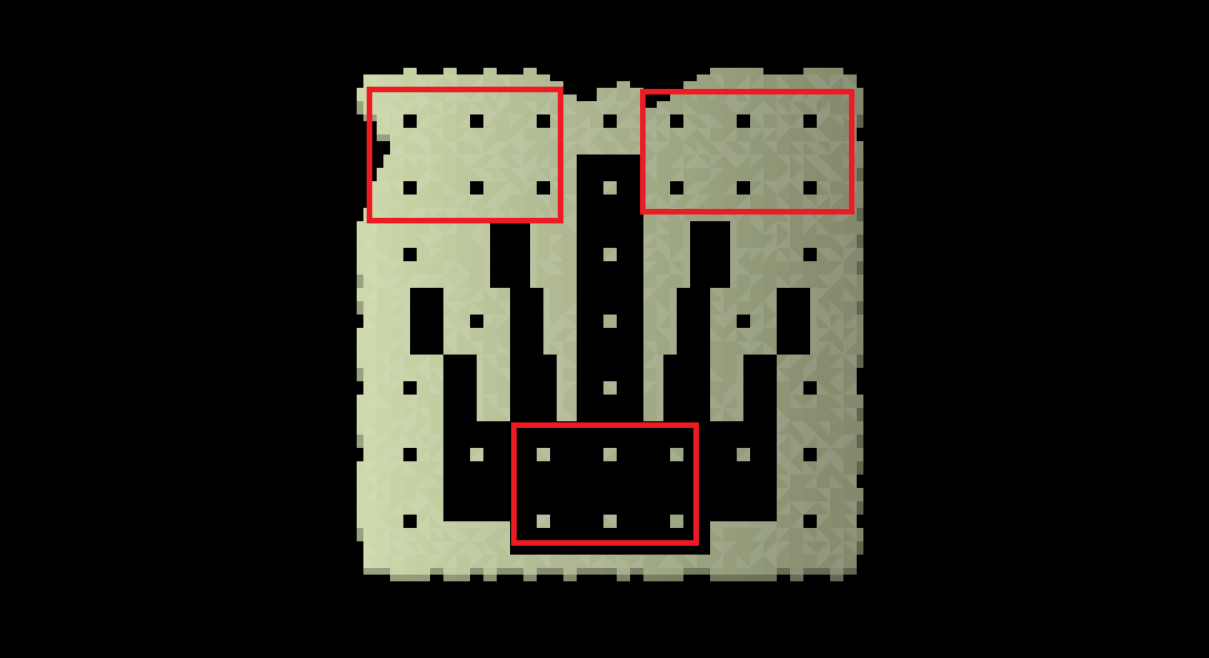
Here, then, the game has instead identified 3 areas where a 7 by 7 image can be inserted without having any overlap between others. Additionally, since these rectangles are all 15 tiles across, it can be placed perfectly in the middle rather than being slightly towards one edge or the other edge of a 10 by 10 box, of the sort shown in the previous picture. What that means is that this particular shape – this particular crown – would be stored in the database as having a range of different options for this clue generation type. The game would then know that it can potentially have three clues as part of this note, since there’s room for three diagrams here, but it will also note it could just have two, or it could just have one, as well. But now to explain what all of this in fact looks like in a finished note, here’s an example with the dots for keeping track of the space removed, and a number of pictures chosen by generation systems and then inserted into the note:
So here’s our first example! This note would be challenging the player to figure out which crown is being shown in the main picture, and then to investigate what potential connections there might be between that crown and the other three symbols being shown here, with the understanding that fully deciphering those connections will lead to some secret, or uncover something, move one forward in that quest, and so on. I think this is a really cool looking example of a clue type! It uses this existing gigantic database of 7 by 7 symbols I’ve now developed in a new way, and also is able to convey how multiple other things might all be connected to, or in some way orbit around, one central thing. However, for less symmetrical base pictures, what became clear was that some slightly uncomfortable or weird looking note permutations became possible. In order to resolve this, there is a second layer which takes place here, where I’ve created a database of acceptable positions and pairings – or triplings, quadruplings, and so on – for symbols within a base picture so that the note still looks attractive and compelling to the viewer, rather than just looking like a bit of a mess where the 7 by 7 symbols have been put in any way they can fit across the note without much concern for aesthetics. This has been a challenging piece of code to write because it’s one of those pieces of code which relies on trying to transform a very base and innate human aesthetic sense into something a computer can spot itself, and make good decisions about. However, I’m actually very happy with how these all come together, and the game has become increasingly competent at finding good locations to put one, two, three, four, or more, symbols into one of these large pictures, and doing so in a way which not just fit into the empty black or white sections, but also just looks good in general. This system is not completely finished yet, because it’s very very very complex, but here are some examples:
Don’t they evoke a nice sense of mystery? I think they do, anyway. Doing this clue archetype has also, unexpectedly, helped me to shed light on one of the key remaining questions: how does the player connect notes, for puzzles that might spread across multiple notes? Well, the answer I think, is simply by deduction and connection, rather than something explicit on a note. Imagine, for example, you find one note that discusses how a certain saint of a certain religion venerated five holy items, and the religion is keen to have those returned. Then, you find one of these new “recursion” types, with an image of an altar and various items around it. It’s then up to the player to make the connection between the altar style, the religion you’d read that information about, and hypothesize – ah, these could be the five things being talked about in the book I read about the life of that saint. Again, this is later game stuff – I anticipate all early game clues being self-contained to a single note, or a single passage in a single book, and so on – but the more I think about it, the more I don’t really see any issues here. With this said, however, my continued study of existing cryptic riddle games has shown that there are a number of very abstract but potentially quite complex and quite important challenges coming up later on when we get into more complex clue threads which are much more easily addressed in a non-PCG game than in a PCG game. I don’t think any of these will be insurmountable problems, but there are certain kinds of interactions which we probably don’t want to reproduce here in a procedurally generated context, and maybe don’t fit well into a permadeath game. We’ll need to think about how to how to continue to develop that same kind of riddle-solving gameplay, but with the very different and distinct game structure that a procedural content generation game offers us. This is going to definitely be an interesting challenge I’ll be returning to often. And, likewise, I think we’ll have to each of these clues first introduce the main image in small size, in another clue, so the player knows what the large shape is. But for now though, this new clue type is coming along nicely!
(And as a reminder, the three “abstract” symbols shown in the top of the two pictures directly above are not symbols which always represent a fixed thing, e.g. an owl picture = an owl, but instead might represent anything in that game world – a place, a person, a concept, an item, an event, a ritual… anything. Those meanings are assigned at game start and will be woven into the more advanced clues in a given playthrough.)
Last, but not least, I’ve mentioned in the past that I really wanted to show some “failures” on the blog to sometimes give a little bit more insight into the development process, as well as showing off finished successes… so I’m going to close this one out by noting something that really didn’t end up working out! Specifically, this was the idea to have the basic visual format of notes changed depending on where the note is coming from. You might remember that I showed a mockup example of what this might look like a few entries ago, specifically for a note from a religion that really liked the colour purple. In that example, we would have taken the default note colour – the sort of slightly off-beige colour, tinted depending on the note with a range of other colours and shades, just to a small degree – and replaced it with the colouring of the religion in question, while the text or diagrams would cease to be black and instead become white. Alongside this idea, I also wanted to give notes a different appearance if they came from different kinds of civilization – so the nomadic and tribal/ancient ones, as well as the sedentary states – and have a couple of other options, too, such as notes coming from cult. My thinking was that the colour schemes would thereby function as a source of information for the player in trying to track which notes might or might not refer to which riddles, and also to add some additional visual variety to the world and the colour palette used for notes (which are going to be a pretty vital part of the game). As such, I actually put quite a few hours into this stuff, and produced a few examples, but…
…they just weren’t all that good. Although I tried quite hard with these and iterated on them a few times, I just couldn’t find any type of aesthetic that looked as good, that looked as readable, and that looked as logical, as the default style (who has purple paper, anyway?). I do think the religion ones (all using a purple example here) are much more pleasant on the eyes than the attempted nomadic note style, but it’s still nowhere near as pleasant on the eyes (or, above, as easy to read, etc) as the default note type. I also had a style for notes from cults, but that basically just a different parchment colour, and the ones for ancient civilizations are frankly so aesthetically and morally heinous that I absolutely refuse to share them (despite what I said above about sharing failures – but there’s failures, and then there’s failures). So, although a reasonable little bit of work went into these, I’ve decided to do away with the idea, and make all notes – regardless of their source or origin – use the style I’ve established in the rest of the notes. To add just a little bit of extra variety, however, I have increased the range of different parchment colours that notes can come in, particularly adding more white and yellow variations alongside the existing biege-grey-brown colour we have at the moment. As for the other note styles, it’s possible I’ll come back to this idea later… but I don’t think it’s likely, honestly. This just didn’t end up looking how I wanted, a lot of these confused the graphics and the imagery the player is actually meant to be looking at, and broke the suspension of disbelief a little bit in the idea that there are scraps of paper in which important, if cryptically-enriddled, information has been scribbled down.
Nevertheless: it was worth a shot.
(Was reading about this failure interesting? Was it a waste of space? I won’t be offended if the latter, but please let me know!)
So, with the new system for adding procedural damage to notes, substantial development on another new clue type will be seeing in later versions, as well as a massive move forward in terms of how books generate and function and what sort of basic technical foundation will be needed for those in the future – and coupling all this with the poetry clues unveiled and discussed last time, which we’ll be coming back to soon and I continue to be very focused on developing – we can now update the master image of clue types and their approximate intended or anticipated difficulty levels. Also from this point on I’ll be adding circles beneath each type showing whether something is being actively developed – beyond a placeholder, I mean – or whether it is finished. The poetry clue type is the first one whose complete generator is being worked on, and thus that now shows a year a yellow circle. Once it’s done I’ll update it to a green one. As I’ve mentioned previously, the poetry archetype is the only one I am determined to have finished for 0.11 – if we have time for more, that’s fantastic, but the poetry archetype is already so spectacularly demanding in both technological and creative terms that it might prove to be enough! But we’ll see.
What next?
Whew! A lot to cover there. Thanks so much for reading everyone – I hope this was an interesting and exciting update, and gives a good sense of how all these mechanics around information and knowledge and examination and deduction are coming together and will continue to come together over the coming months. The notes look so much more organic now, the books have taken a massive leap forward to the point where they can essentially handle any kind of arbitrary data now, we’ve got an interesting new clue type which will find its way fully into the game in the later version, and although I didn’t talk about it much in this entry – because this post is already more than long enough! – I continue to put in massive amounts of work into the poetry clue generator, which I’ll be talking more about soon in a forthcoming blog update. I’ll be sticking to the fortnightly updates (!!!) for the foreseeable future, so please do come back in two weeks to check out the next additions to the game. In the meantime, I’d love to read any comments with any thoughts, observations, questions – or critiques! – you might have, and also, please do think about sharing this with friends or with others on the web if you think they would find it interesting! I always know there are so many out there who would be interested in this project, but it can be hard sometimes to reach them, I think.
Thanks again everyone, and see you all in two weeks!
To be fair, book generation is an entire subfield of PCG all by itself, big enough to have a dedicated annual event. No wonder few game developers attempt to use it as a mere subsystem on top of everything else they have to do.
That said, I love how notes look. You nailed the appearance of parchment perfectly. Experiments were definitely worth it too.
Thanks so much Felix! I really appreciate the comment. Heh, you’re right – book gen is something I’m really looking forward to. And so glad you like how they look; I still like the idea of adding splashed paint on some, or water damage, or splattered blood, etc, but not a priority right now!
I never cease to be amazed at your energy and fortitude. Perfectionism is usually considered to kill projects because the release date can be pushed back more than 10^10^120 years when the universe reaches an energy minimum and no more energy can be extracted, heat death. Nevertheless, the roguelike genre is the very one place where perfectionism is necessary, whatever it takes. As for failures: they are just as important as successes. You shouldn’t blame yourself too much for it, because the best reward is gained: experience. You also need to accept it with Zen-like samurai humility that failure is sometimes necessary. As a part of life. Generating poetry must be monstrously difficult. Do you use LLM engines for this? I’ve always been impressed by cosmological myths, so this post got me hooked today. Quite remarkably, the resulting generated text contains the traditional contradictions common to all religions in describing genesis. Namely: (1) Nothing lived or moved nor existed or grew old… and straight away: (2) the child of Sapling… This is marvelous! No sarcasm. This is exactly how religious texts should be arranged. Another interesting point is the death as primary cosmological essence before creation. Never seen anything like that. Usually it is chaos or darkness, endless water. Here: Death. Interesting from the standpoint of dialectics. A certain duality is already assumed at this stage, because death cannot be defined without life, so from the first words of this wonderful text there is already a model of a cyclic universe, a dying and reborn world. It is so aptly! About purple paper. Theoretically, the papyrus could be soaked in Tyrian Purple similar to what was done with cloth. It is a dye of various shades from black to dark purple extracted from the marine gastropod mollusk, the echinoderm from Lebanon. Sophisticated connoisseurs of the roguelike genre will surely demand more complex and versatile interaction mechanics. The papyrus can also be burned, partially or completely, doused with blood, acid or alkali, and there are even more possible interactions with other objects and living things. I’m fascinated by the interaction model in the Noita game, it almost claims to be universal. There’s also tablets with cryptic texts and puzzles, but they’re more focused on interaction rather than finding and combining items. It even has its own runic language, which, however, is mostly decorative in nature. https://noita.wiki.gg/wiki/Puzzles Of course Noita is a different game with its own specifics, I just gave it as an example. I’m convinced that the future of gaming will be exactly like URR and Noita in terms of complexity of generation and universal interaction patterns. Best wishes, sir, in your noble Work. With deepest respect and best regards…
Hello dreamer, thanks so much for the message! No LLM at all (and there never will be) – all PCG! Will reveal more in a later entry about the exact systems. And I’m glad you like that text, this would be for a holy book – not something I’m fully generating for 0.11, but very much in the 0.12 or very close beyond list of stuff to do. I’m really looking forward to creating a generator for vast numbers of interesting cosmologies, and THEN of course connecting those to all the clue generation and riddle generation…
Burned: yes! I hadn’t even thought of that one. I like that a lot. I think I can see how I would incorporate that, graphically speaking. Noita is amazing, I’ve enjoyed it greatly and its puzzles are definitely in the sort of area I’m working towards generating, though I think a lot of Noita’s lean very strongly away from clues that are easily solvable by one person playing. That’s fine – I think community-solved puzzles are neat as well – but I’m definitely going for things a single person can solve, even if it’s intellectually demanding. Or, perhaps we do end up with some community-solved puzzles, but those are just extreme, optional, end-game ones, beyond the main quest…
Oh, I’m happy, I was useful with the idea of burned notes. Looking forward about details on PCG. I’m not a developer/coder but still very interesting. LLMs sometimes generates absurd stuff. Although the latest versions of corporate AI chats are quite almost looking as reasonable. (Not really reasonable of course.) I was dreaming of the idea the game content could be AI-generated. The problems will be hallucinatory stuff, absence of clear rules of logic and overall inconsistence with the game narratives. So at the moment PCG rules are better. Structured quests and structured rule-based sequences like riddles are critically important. Noita is sweet. I play periodically, never ascended yet though. This game exploits cosmological themes a lot too from the very from opening splash screen to the ultimate endings including new sun creation (or new black star). It suggests some very profound thoughts about purpose of life, etc. Cosmology and myth was very strong in Rogue and Nethack. So what you are doing is really really very important: “a generator for vast numbers of interesting cosmologies” – mmm! Paradise! I always was trying to visualize alternative cosmology and myth settings in Nethack. The most prominent example is the Infidel role implemented in some of Nethack forks and Anachronaut role. The first one mission is quite opposite to the original game: to serve the evil and to deliver the Amulet back to hell for Moloch. The second is time-treveller from the future and he/she is not able to pray because of atheism but he/she can use extremely efficient futuristic weapons in the fantasy world, but still compatible with Terry Pratchett’s time-travelling and manipulation or alternate realities concepts. I believe a good game should potentially generate every possible variant of rules and settings. Every element of the game should have some sense. That why I don’t understand why praying and desecration of holy statues in Caves of Qud doesn’t have any significant consequences. If magic and gods are prohibited in the game world then it still could still have repercussions on some psychic and quantum level. Everything should be interconnected, every game mechanic should have practical sense inside the game world! One of the most extreme case of optional game riddle is probably FF06B5 in Cyberpunk, https://www.youtube.com/watch?v=vzQh4RuFAs0 with particularly interesting concepts concerning the fundamental cosmological constants. These constants are deemed to be important for the world generation and laws of the world and directly connect Cyberpunk 2077 and Witcher 3 universes. The idea of the multiverse that allows for the creation of different versions of worlds and possible even travelling between them is fascinating. One of the possible idea of exploitation of this is letting the player move into another world (generated from another seed number) to find specific object there, retrieve it and return to the original world to complete the quest. Sorry for long-posting, just tossing possible ideas. In fact, I’m still hoping for progress on a more detailed combat mode one day in URR because advanced fighting is very crucial element. Thanks! Cheers! All the best to you!
Thanks so much for the comment, dreamer! I confess to actually being someone with very Strong Feelings about LLMs (though this stems more from my day job than my game dev work). I’m never going to be incorporating any AI here – I agree PCG rules are better now, though I actually think they’ll always be better, there’s just no way an AI can reach the same level of precision, and guarantee that what it produces will be sensible (and more generally, speaking artistically / creatively – I couldn’t live with myself if I used one of the bloody things!).
Anyway, that’s really interesting about NetHack forks (and new knowledge to me) and thank you for introducing me to that CP2077 riddle, I hadn’t come across that before. I’m always trying to soak up as much of that kind of information as there is, even if it’s in games that I haven’t really played myself, because it’ll point me towards new types of riddles, new types of clues, new ways to connect things in the game world in interesting ways for a player, and so on.
Finally, re: combat, oh it’s coming! Absolutely. Still sticking with the idea of combat as very very rare, and very very deadly – so more like “duels” than anything else. It might or might not be a 0.12 objective, but if not, it’ll 100% be 0.13. You can hold me to this! 🙂
I’ve only just found this game, and I am truly blown away by it’s scope and by the passion you show for it. I’m very interested to see how this turns out. Keep up the good fight! Pob lwc!
Hello Shane, thank you so much for the message (and the good luck!). I really appreciate them, thank you :). Welcome!
Great work on the books, both in terms of text and in picture placement. As someone who obsessively collected all of the in-game books when playing Morrowind and carefully arranged them in order on the shelves of my stronghold (…and ended up as a librarian IRL, since I was apparently playing one in the game…), I can appreciate the work that goes into making these. How long are the books going to be? Will there be a range of lengths? If they’re created during world generation then I imagine they can’t all be 500-page tomes, even if that would make sense for religious holy books and so forth. On the other hand, if you have a clue that refers you to a specific page number, then the length isn’t as important — the player can just skip to the page in question. It’s reminiscent of the final puzzle in the original Myst, which had a book filled with hundreds of possible solutions to the final puzzle. The trick was knowing which page was correct, which was a puzzle in itself.
I like the damaged notes, too — I can’t even imagine how you’d go about coding something like that, particularly with the ability to piece notes together. Will it be possible for books to be damaged, too? Or individual *pages* in books (especially if they’re very old)? Aside from the possibility of burned notes that dreamer mentioned above, you might also consider damage from water, mold, and insects.
Regarding different-colored pages, you’re probably right about sticking with shades of white and brown just like real paper, papyrus, and parchment. I do like the idea of rare notes & books with different-colored ink, though. I can imagine a religion or government using gold and silver inks for particularly important works, or red inks (blood?) from violent societies, or more exotic colors from societies and religions that use those colors in their heraldry, etc.
The recursive clues look awesome, too! The possibilities boggle the mind — those are going to be a big (and late-game) challenge to solve, but a fascinating one. I can already see how critical the player journal is going to be for solving these, with its ability to sort clues so players can look through it to see if they’ve seen any of the symbols before, and hopefully figure it out from there.
Great progress as always, and thanks for the update. Although now you’ve got me awfully curious about what those “heinous” ancient civilization notes looked like! ?
Thank you for the comment, crowbar! Love the Morrowind librarian experience (I’ve never played Morrowind, actually, but I have it downloaded and installed… probably not a 2025 game, but soon, though). Length: great question. It’ll vary, for sure – I’d anticipate holy books or major historical texts maybe pushing towards 50, and shorter “novels” being, realistically, novellas / short stories, and coming in around 10-15. Generally I think the length of a book will correlate with the amount of data in it, whether that’s data for solving *other* riddles, or riddles which are started *within* the book in question (i.e. you read a bit and think, hmm, that’s interesting…)
Re: book damage – good question! I’m coding that in tonight, and it’s not looking great so far… it definitely needs some work. Not visually coming quite as smoothly as the notes, though not quite sure why. I’m also toying with the idea of you being able to see the page behind through a damaged page, which would be Cool but also Very Different To Code, so we’ll see. But yeah, some kind of damage will definitely be possible on pages, it just needs a bit longer in the oven first!
Very rare books notes – mm, that’s possible! I’ll keep the code there in case I want to return to it later. Definitely some cool ideas there 🙂 – so, maybe! Maybe colours could only be on the corners, perhaps.
And, hahaha, maybe they weren’t that bad – just very dark, with light writing, and sort of… stripes… urgh, no, actually, they *were* terrible. I take it back!