For the last several years a number of folks in the PCG world, especially those who are or were based at NYU, have been running the “Generative Design in Minecraft Competition” or GDMC, in which people are challenged to create an AI that can construct a logical, functional, appropriate, and aesthetically-pleasing, settlement within Minecraft. I was very flattered a few years ago to be invited onto the judging board for the competition, and found the judging process in both 2018 and 2019 to be hugely rewarding (and tremendously interesting, as well).
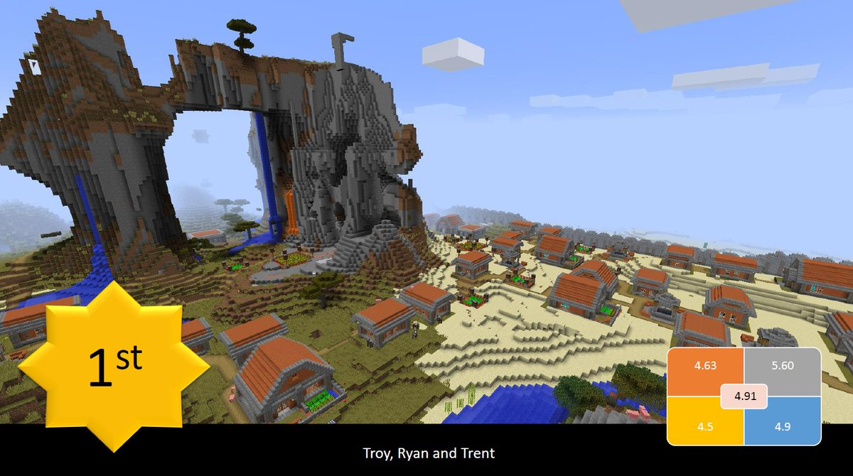
Sadly last year I wasn’t able to judge due to serious ill health, but this year things are better and it has been wonderful to resume my judging role. It’s a fascinating competition and it has been a real pleasure to properly engage with this community again and see how impressively things have come along since I last graded submissions back in 2019. In truth I am blown away by some of the entries this year – the quality has massively increased especially at the “upper end” of competitions, and it’s also lovely to see some newer designers beginning to dip their toes in and still being able to produce interesting and convincing generators.
This year the competition used two maps, and I decided to judge the “Volcano” map which – as the title suggests – contains a large volcano in its centre, whose high elevation and lava flows are of course something the generators need to figure out how to pay attention (although most, as we’ll see, actually struggled with this part of the map quite significantly, and in doing so really highlighted a number of future directions for these generators to take). There were 20 entries this year and I tried to submit the most detailed thoughts I could muster on all 20 to the organising panel, but here I thought it would be interesting to give you all a sense of these generators, what attracted my attention and what didn’t, and some broader thoughts about the competition and the sorts of things people are creating. Generating settlements is obviously a big part of my own PCG work and it’s inspiring to see what others are doing in these areas, and to help support what I think is a really compelling and enjoyable initiative / competition. Although I’ve since submitted my feedback and I look forward to seeing the results – there are 3 or 4 entries which I think have the highest chance of winning the overall prize, although I may well be surprised – I thought it would be interesting to talk about the competition, the entries, and my judging process and thoughts here. If you have Minecraft you can go and download all of these yourself if you want to have a look. So, without further ado:
Entry #1:
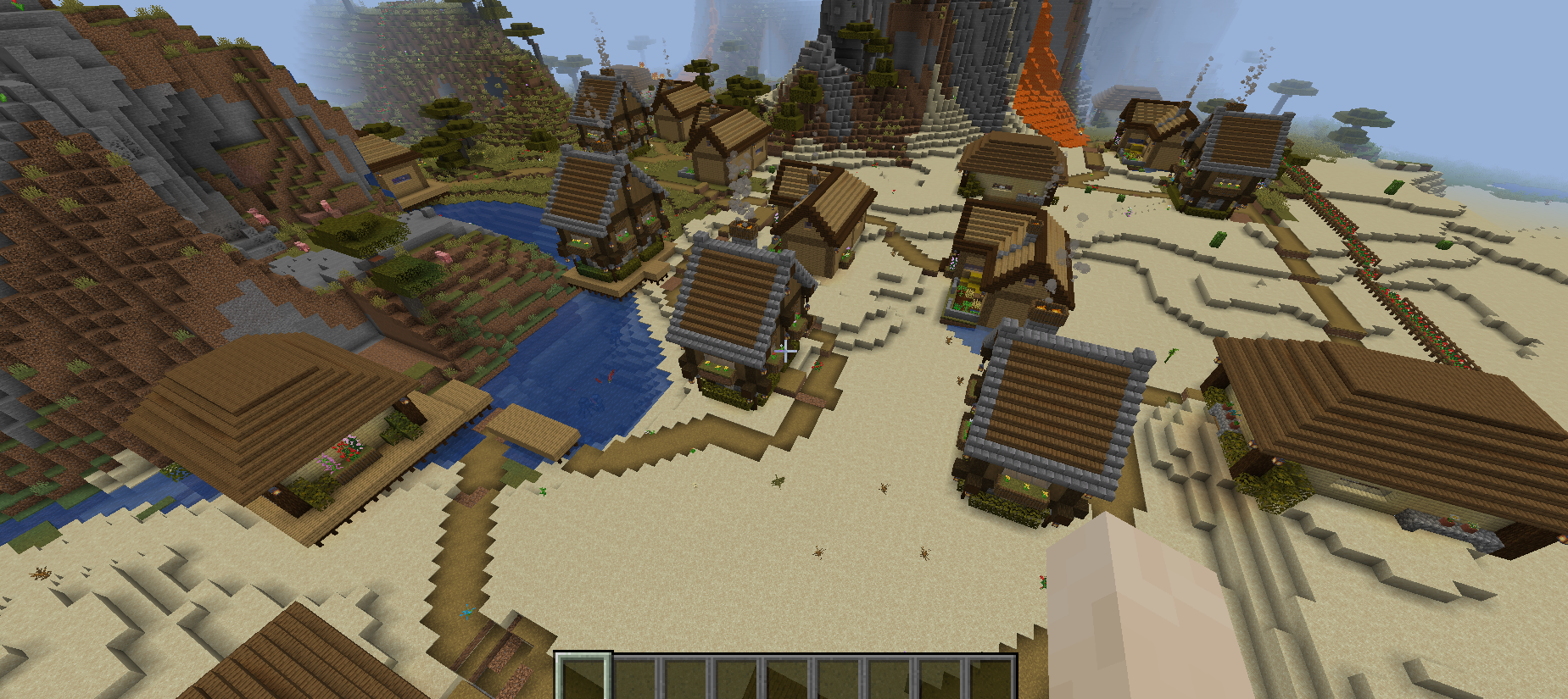
This generator created some really lovely homes – I liked the archetype and there was some good variety in how they looked. The interiors worked well and were not simply empty (interiors are definitely something “secondary” in a lot of generators) and showed nice variety and difference between the various houses one could explore. The buildings were quite sparse in this one when compared to some other generators but this is certainly not inherently a bad thing, as it gave a nice sense of a more rural area where space is not necessarily at a premium, whereas lots of generators (in this competition and elsewhere, including my own work) tend to go for denser, more tightly-packed settlements. Within this context I wonder about the boundary wall of flowers, however, which can be seen at the right-hand side of the upper picture; I’m not sure how appropriate it was and how well it slotted in with the rest of the generation, and it also did some extreme climbing up and down hills, which perhaps made it a little peculiar. “Walls” around generated areas can often be tricky, especially with terrain to integrate with, and I think this is one area for more work in the future.
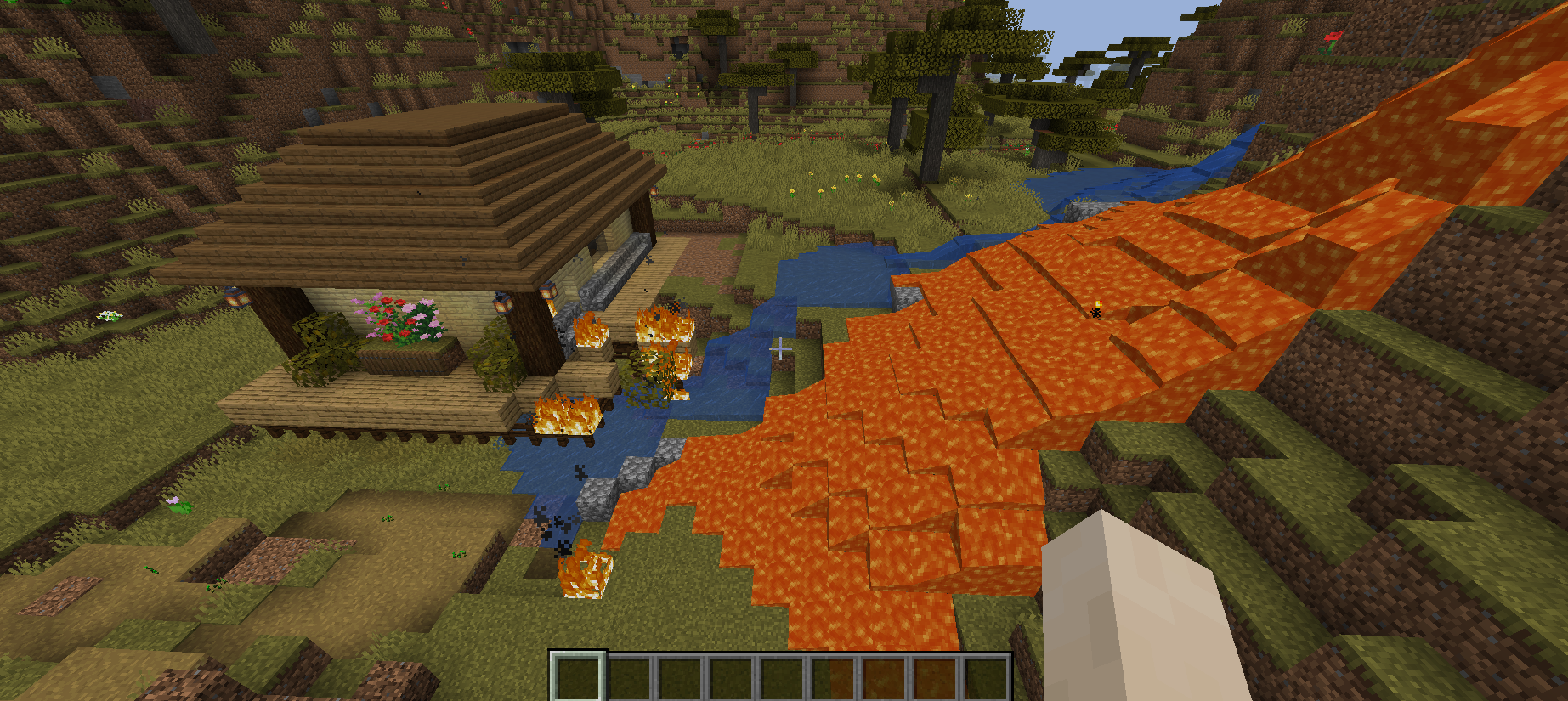
Equally, one house spawned a little too close to a lava flow and burned down while I was exploring the map, as you can see in picture 2! The road system of this generator was a definite highlight as the roads were all appropriate, connected all the relevant things, and tended not to double back on each other or create weird loops or all the other thing one sometimes sees when trying to generate roads. Overall I think this was a very sound generator, and although the edges need more work, the buildings were lovely (though whoever gave planning permission for that one near the lava flow should be out of a job!).
Entry #2:
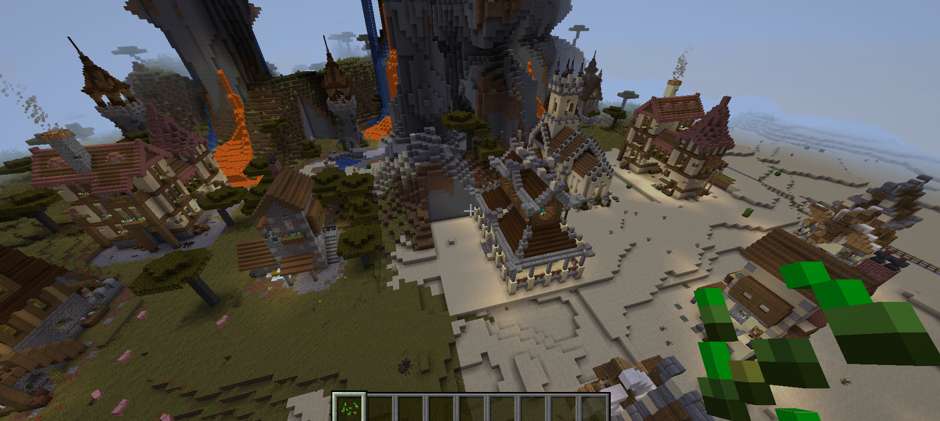
This generator was excellent. The buildings were varied but still held to a clear architectural style; the interiors were exquisitely detailed and varied; the NPCs were a lovely touch and it was great to see them wandering around the town and really helping bring it to life; there were so many nice details like the lights outside the buildings at night and a great deal of detail in the exterior construction of the buildings; and I also loved that a few buildings had been placed right at the top of the mountain, and generally in a somewhat sensible way.
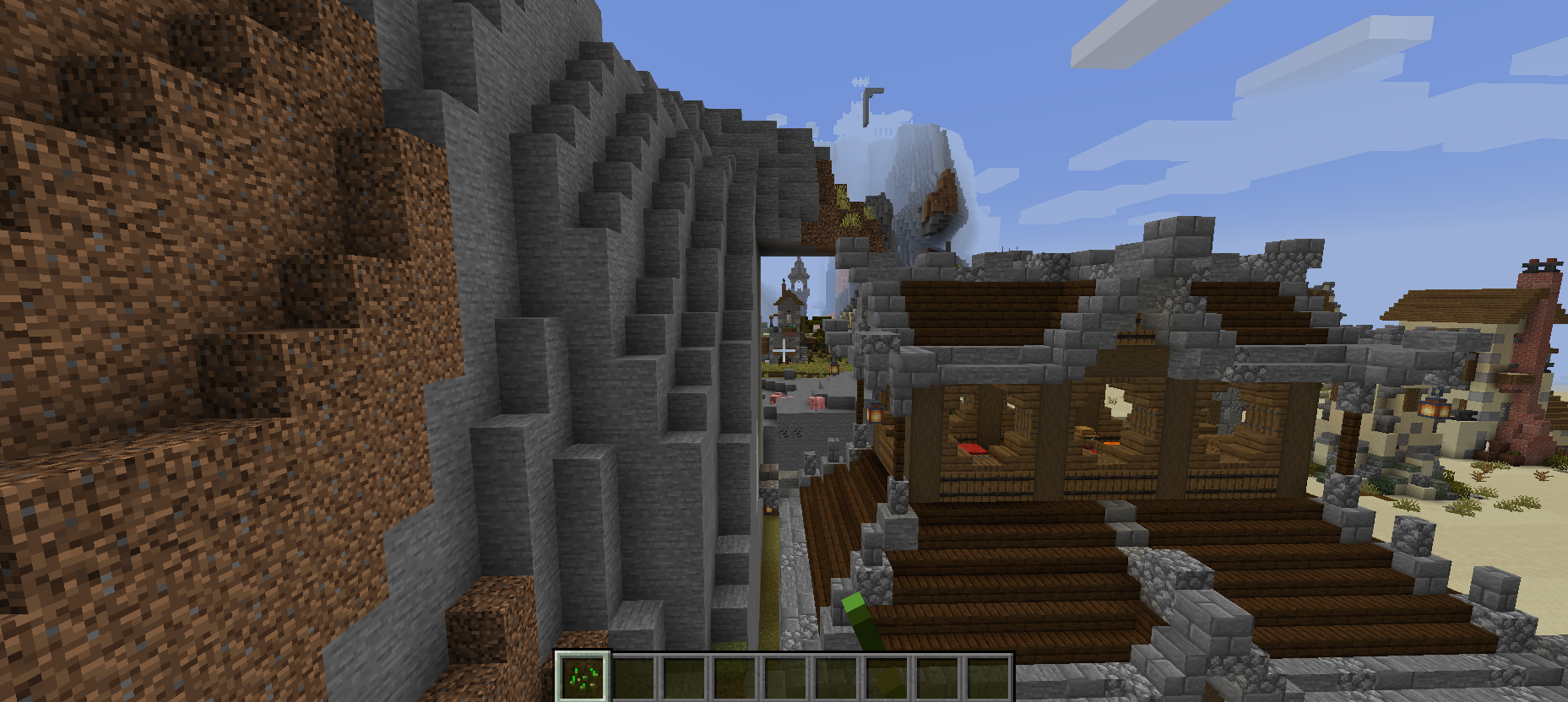
However, the only issues came from the buildings at the top of the mountain having a wide “pad” of land which extended over open sky, and another building at the base that had clearly “cut out” part of the mountain in a very inorganic way; but these were truly minor critiques (and perhaps the next things for the generator!). I also wasn’t sure about the “wall” surrounding the town, which was very jarring when set against the fluidity and detail of the rest of it. But like I say, these are minor points: this generator was honestly excellent, absolutely first-rate.
Entry #3:
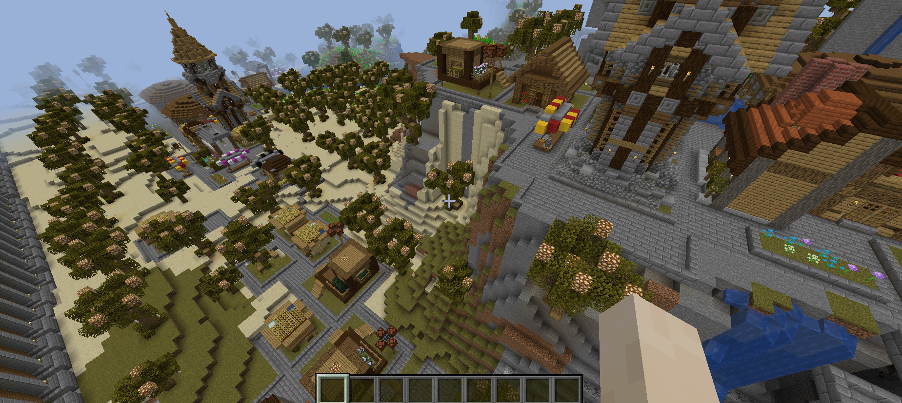
What stood out most about this entry was the range of buildings – there were plenty of houses of various sorts, plenty of towers, plenty of what I take to be sort of libraries or cafes (or both?), and they were both grouped nicely and distributed nicely within the generating area. There was so much creativity and variety here (I love the little shop stalls on the streets!) and it really showed how many options there are for buildings that can appear, and the variation within each building archetype itself. The natural areas were lovely and integrated well with the more human-structured parts of the generation. The trees were a nice addition although I think their spacing was simultaneously too regular and too irregular – they were too regular to look natural, yet still somewhat irregular, so didn’t look totally human-planted either; maybe these could be split in half into one generator that explicitly plants trees in places humans would, e.g. along streets, and another which places them at random. I also confess I am not quite sure whether the immense towers were deliberate or not – were these meant to be so huge as part of the external wall, or not?
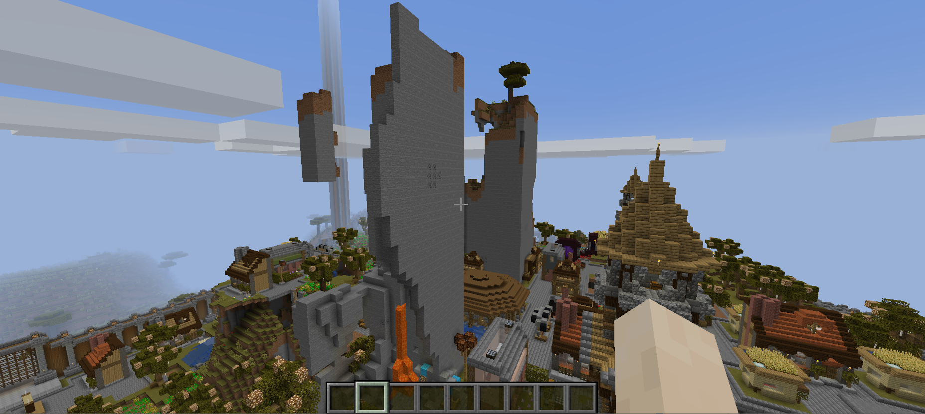
However, this one absolutely butchered the volcano! There were various large thin “sheets” of rock left, sometimes left hanging in the area, where I assume an infinitely upwards-climbing z axis of space had been carved out to make room for the features the generator wanted to spawn. As part of this issue I also found a flooded house, and I don’t think the generator engaged all that much with the existing terrain more generally. Although this one has to “lose marks” due to the strong lack of adaptability with the volcano – though at least nothing was set on fire! – this was otherwise a really stunning piece of work, extremely impressive.
Entry #4:
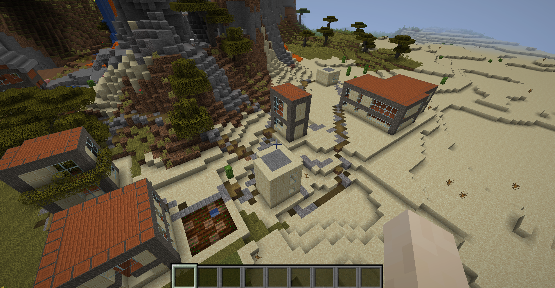
There were some nice buildings in this one! They were quite unlike what the other generators produced and gave a nice sense of a place rather different from lots of the entries. It would be fantastic to get some interior detail as well, and perhaps some connections between the different buildings via roads or paths or whatever seems appropriate. I encourage the creators to keep with this one, this has a different style in its buildings and one that I think is worth pursuing further.
Entry #5:
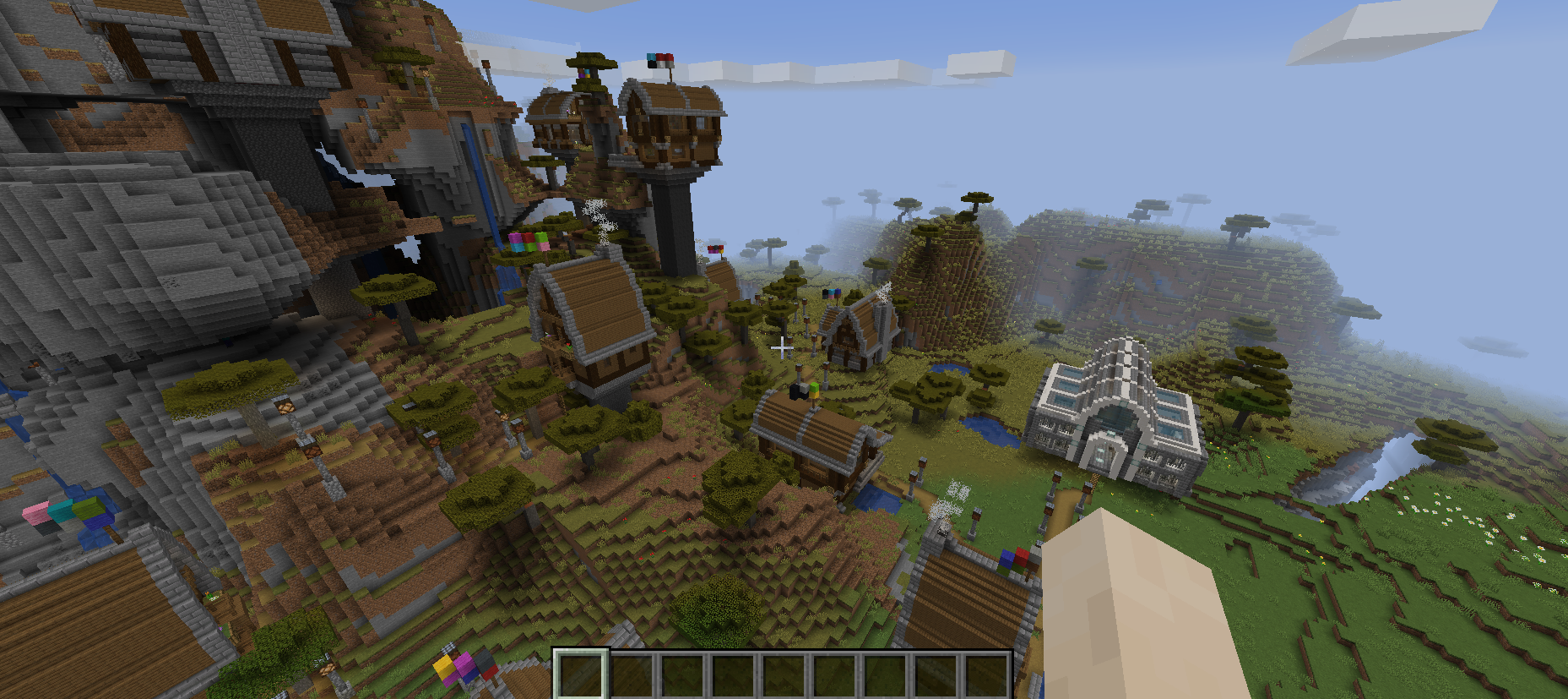
I really liked this one a lot. The buildings were convincing and interesting, most of them were nicely integrated into the terrain, and the special building worked well (I really liked the presence of a the hidden passageway only revealed by hitting the appropriate switch). The houses that were up on pillars could easily have been rather strange – and I am sure I see why they were generated by the systems – but the use of the ladders really worked to offset some of the strangeness. That said though I was surprised the special building (church? cathedral?) spawned on that raised plinth, and I wonder whether this was deliberate or it was a response to being chosen to generate on a piece of terrain that was already high. I think a mix of ladders and steps might have worked well here, especially for the really short ladders. The long ones worked fine (put me in mind of some of those structures in Wind Waker) but for the small ladders I feel a more natural option would have been stairs instead. Nevertheless, it’s a good technique to integrate the homes with the rest of the map if the building is a bit of an edge case and you still need to fit it in and make sure it can spawn a logical door and a way to access the door. The flags and the smoke were beautiful details as well, and helped the place come alive a little more.
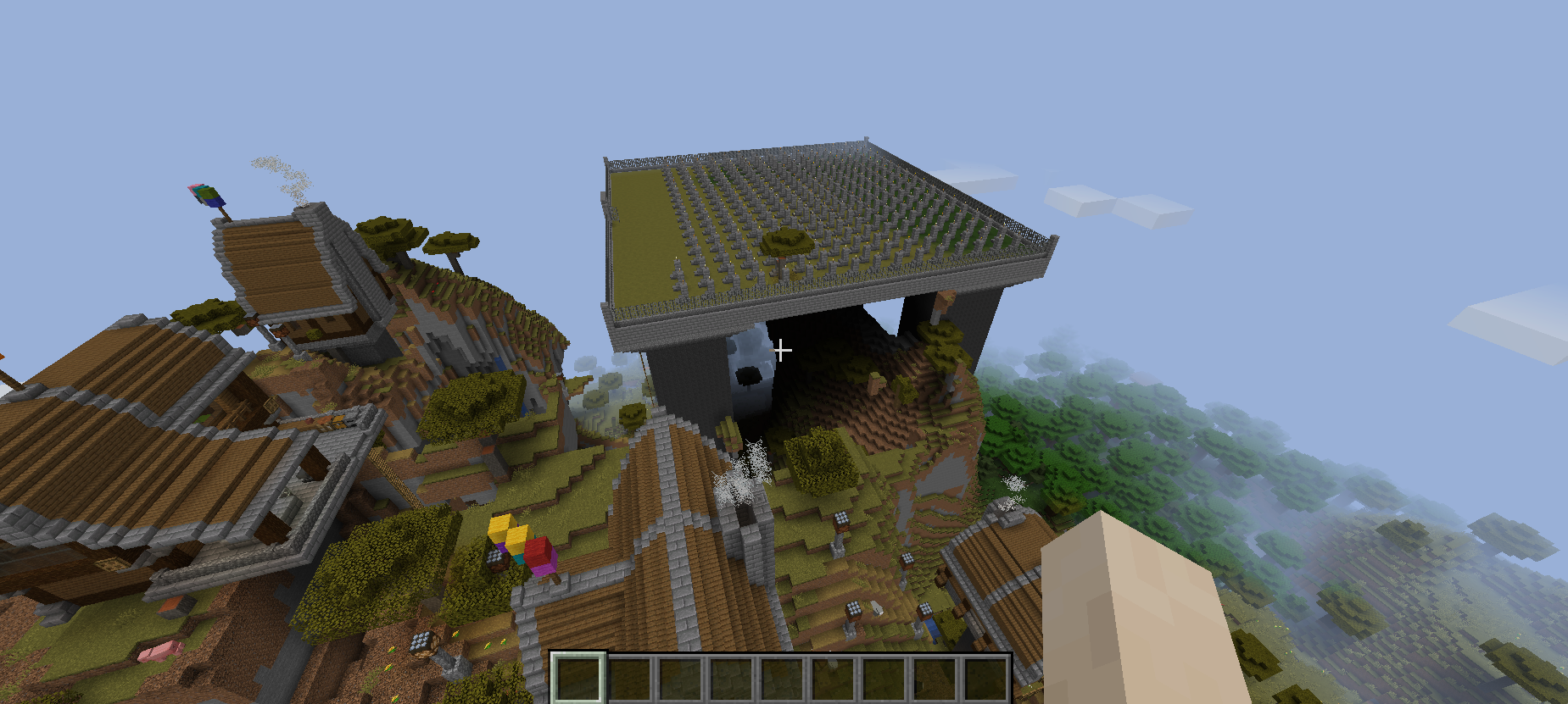
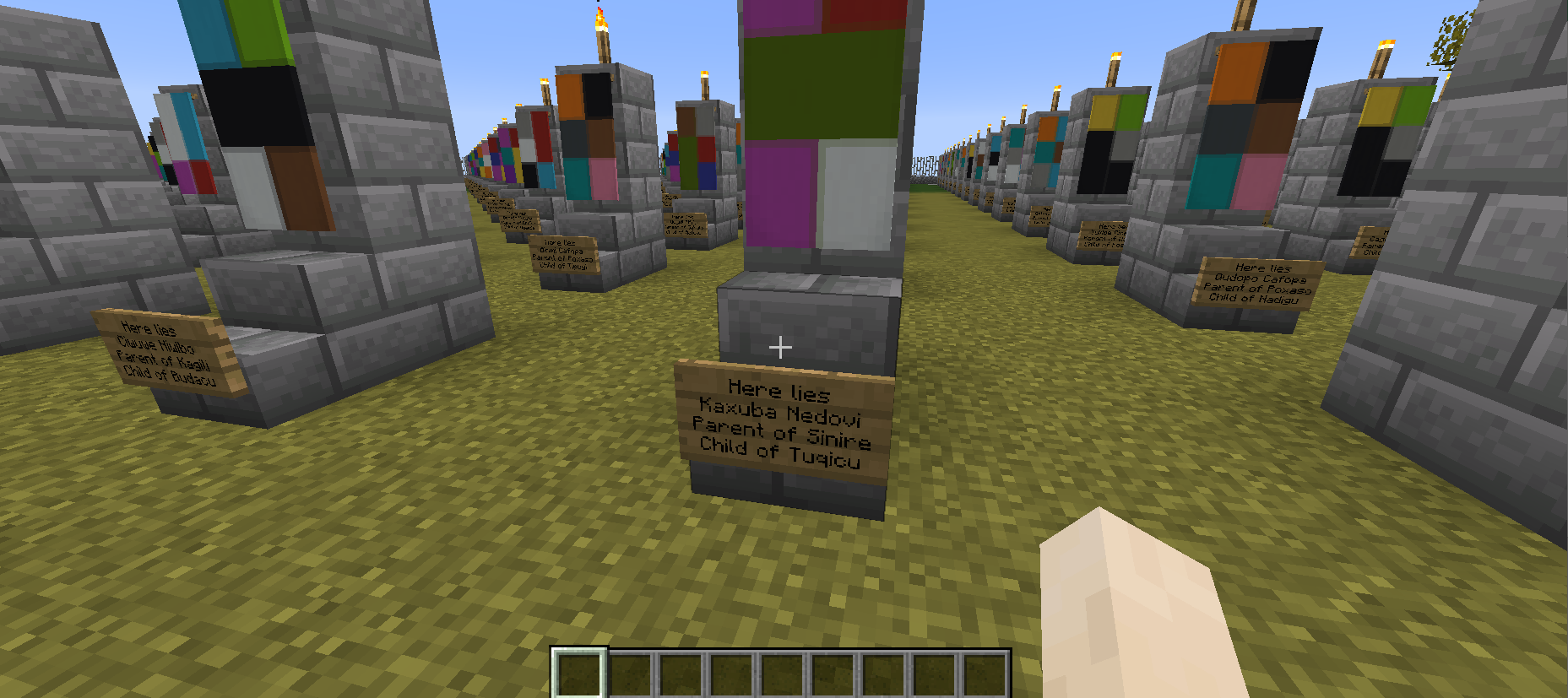
The graveyard was awesome and really well-developed, though I think it confirms my feeling that the whole thing spawned so high simply because one bit of terrain in its spawning area was so high. It’s certainly an interesting place to bury your dead (a new version of a sky burial?) – still, I love the graveyard itself, although I think where it generated would be great with more code to stop it spawning this towering edifice! I also noticed that one house spawned in a rather, uh, unfortunate location, and burned up, although I couldn’t see precisely where the lava had first “got in”. Overall I thought this one was great, and although it “struggled” with height differences in one sense, the ladders were a really elegant and well-developed solution. Great stuff!
Entry #6:
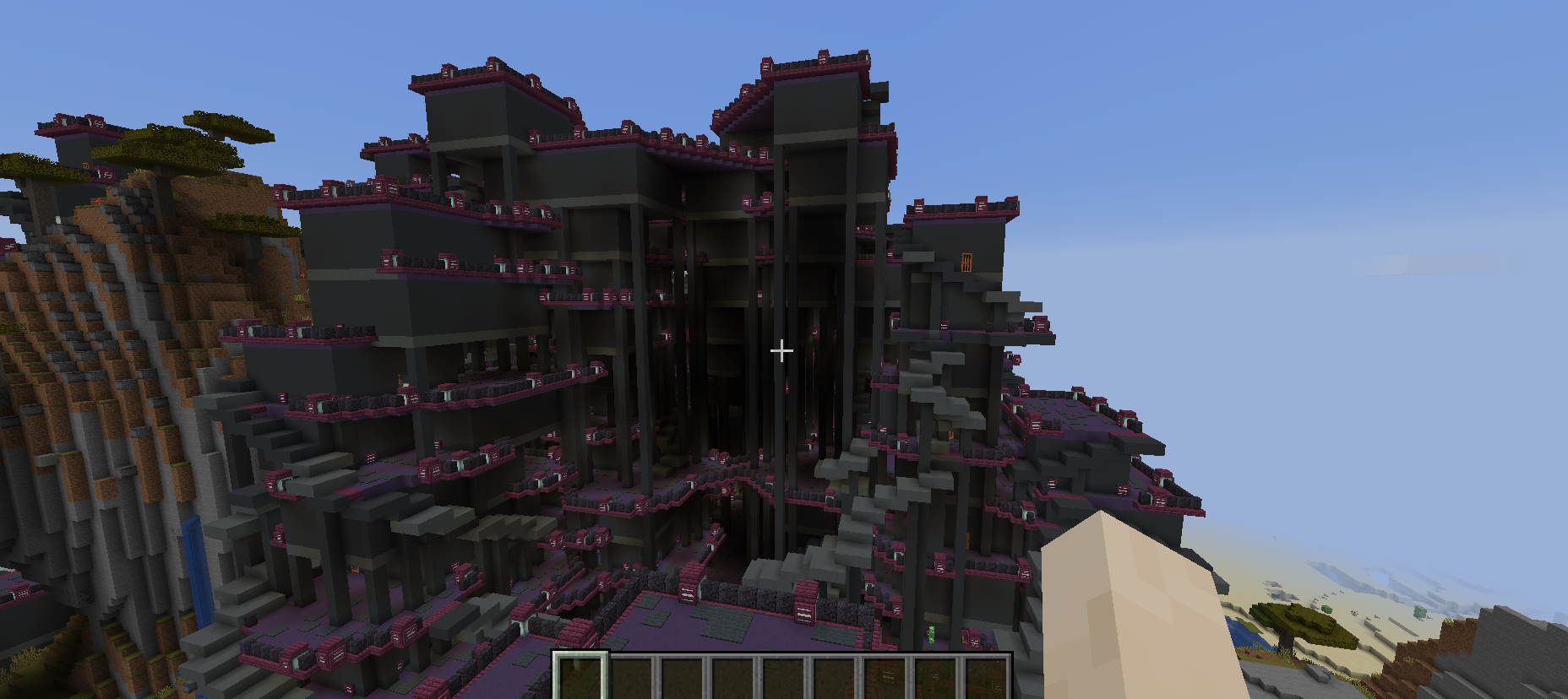
Now this one was interesting. This generator was really completely unlike any other I’ve seen, and not just did it go beyond the usual “medieval”-y stuff (where others for instance make modern-day cities or towns) but it seemed to really have its own very distinctive and unusual look. If anything this one struck me as “futuristic” in nature – it particularly reminded me of Hengsha in Deus Ex: Human Revolution. As far as I can tell all these different levels do, indeed, connect with their staircases (I wonder whether “stair” items could be spawned on them to make them smoother?) and I was very pleased to see that all the interiors actually contain things! It also seemed to have largely worked with the existing terrain instead of just cutting it aside, although I suspect that sense would have been given on any terrain and the overall generator was not massively affected by working its way up a mountain (but I might be wrong, in which case I give it insufficient credit). This was bold and weird and interesting, and I liked it a lot; I think the next improvement would be to add more “high-level” variety, e.g. different districts with different colours, or slightly different shapes, etc. Great stuff.
Entry #7:
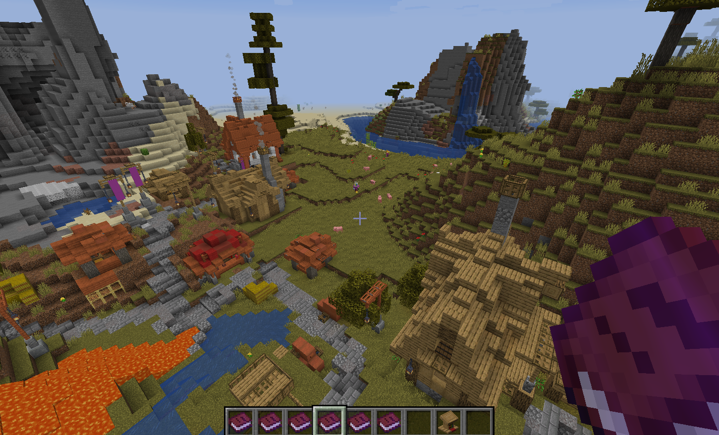
This was a really nice piece of work! The buildings were lovely and appropriate, and the banners were a really nice and distinctive touch. In particular, however, the interiors of the buildings really stood out – there was a lot of detail crammed into these relatively small spaces, and they gave a wonderful homely sense. The chimneys were a nice touch and the buildings were both aesthetically similar enough to clearly come from a single architectural style, while also different enough to prevent repetition or boredom. Some of the smaller building were very intriguing and although the village generated very near the lava flow – which burned a number of other generators in this competition! – it appears this particular village avoided destruction. This is a lovely piece of work, and although for instance the roads could be improved with stairs for example, this is a nit-pick on an otherwise first-rate submission.
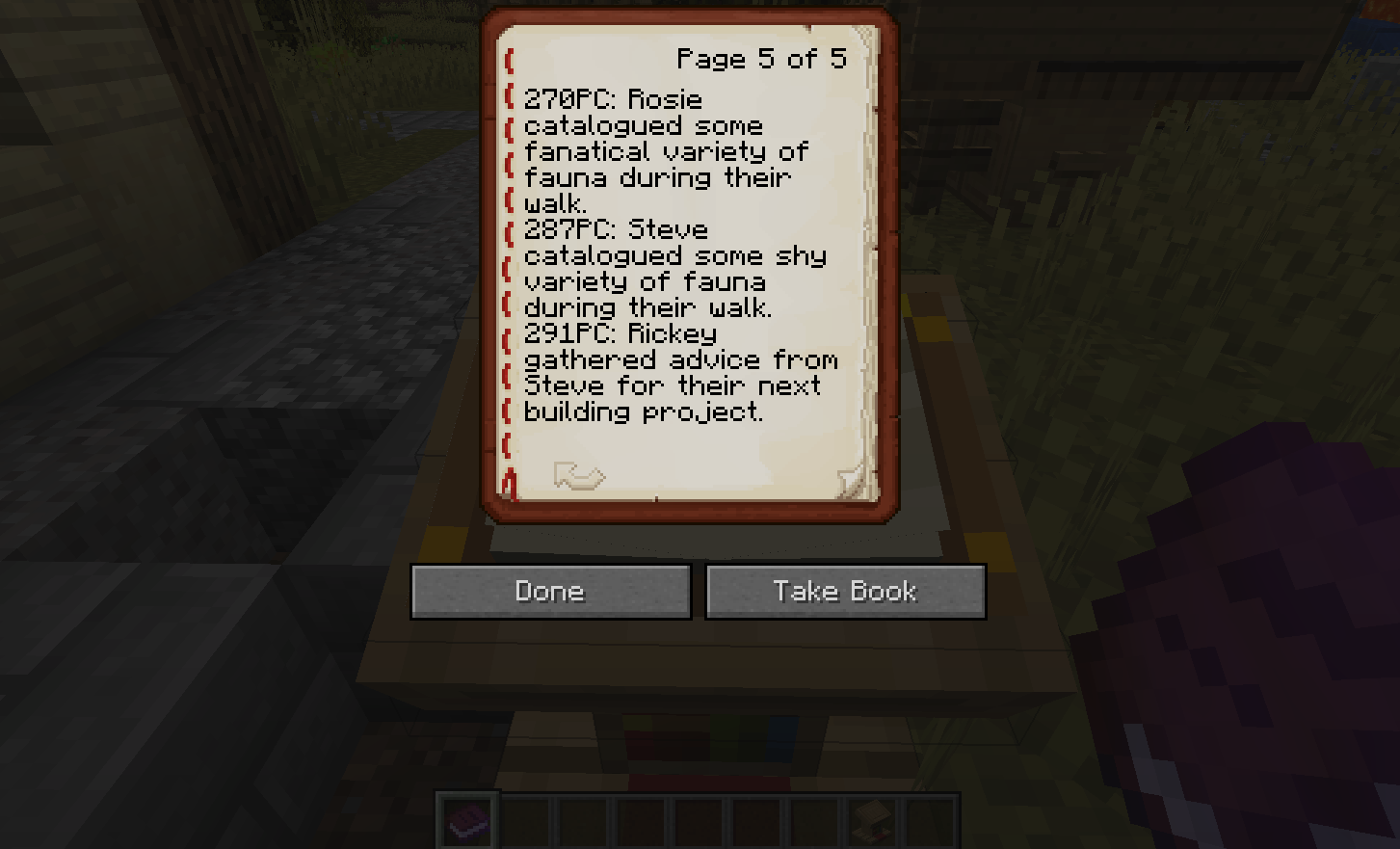
I also really enjoyed the generated history of the town that was included in this entry; this was a really nice start to beginning to flesh out this element of the competition. The chronicle showed a good range of “events” – finding a way to do something, or some social event, or whatever – and they varied quite nicely in their details. The sentences were generally grammatically and conceptually sensible and even showed progression as time goes by! Perhaps the next step would be to distinguish between, say, events of different importance, and use that to structure how they are written about? But yes, this was a great entry I thought, one of the strongest from this year.
Entry #8:
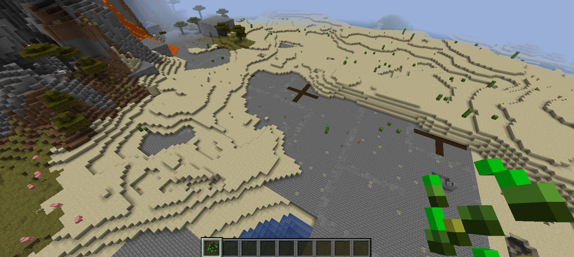
This was an unusual one, and it was a little hard to figure out the intended algorithm. I think a settlement was largely being spawned within the existing land, since there were large chunks of grey terrain. There were however some large cuboid grey buildings, although some lacked doors. Many were buried partly in the ground, giving – I think intentionally? – a kind of “bunker” look? There was some interesting stuff here and I’d like to see how this one might develop into something quite different, though I think right now it was either at quite an early stage, or not working correctly, or possibly both!
Entry #9:
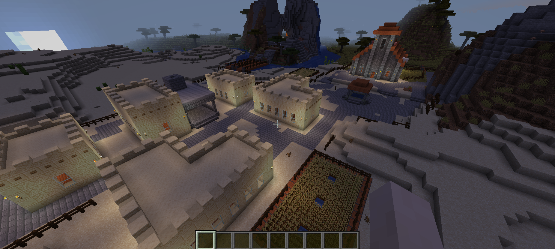
I really liked the main buildings in this one – very different from the sort of archetypal “medieval” buildings one sees in Minecraft and many games. These had a nice north African feel to them, and were particularly evocative during the night-time biome. The gardens worked well and it was great to see the roads, even if the generator did create a few strange loops and so forth (which often happens with road generators). The bridges were also really nicely designed. The interiors of the buildings were pleasant and it was nice to see some detail being spent on this aspect of the generator. The main civic/religious building also looked pleasing although marked a very different architectural style from the others we saw in this generator, and that might be something to work on. Overall I like this one a lot, the outside aesthetic was strong and it showed clear ambition and visual elements to set it apart from the others; it’ll be great to see how this one develops in the future.
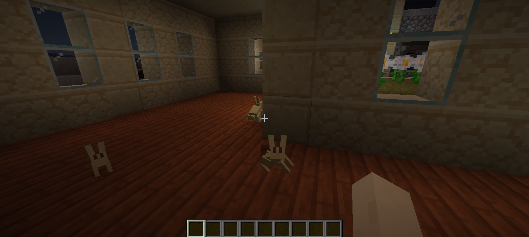
There were also rabbits here, who – little did I know it – were foreshadowing a future encounter with their kind in a later generator.
Entry #10:
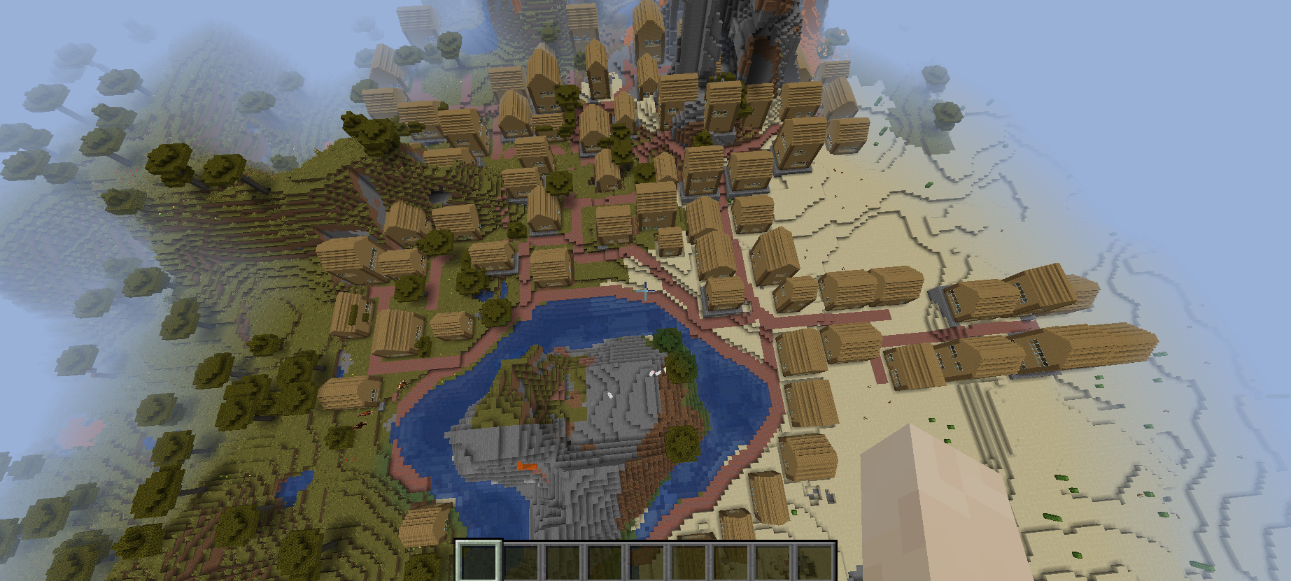
These are really nice buildings in this generation, and their layout and the combination between the layout and the roads works really well. They are nicely clustered while also giving a sense of the organic growth of this settlement, especially around the river. The houses are nicely spread out but do not attempt to climb up the volcano / mountain walls, which is a really strong part of this generator. The road around the river is okay, but perhaps the weakest part of this at the macro scale since it’s very obvious how this part works; although I see the logic in using the river as a kind of “anchor” for the rest of the settlement, I think this could be a little more varied. The houses themselves are sufficiently similar to evoke a coherent aesthetic while also being sufficiently different to not get boring; the door and window locations and numbers vary nicely, and the interiors have some good stuff in them, though these sorts of buildings are really just crying out for more interior variation and also a second floor! One of the houses really “carved out” its space from the mountain, and in the context it looks “ok” though I think that element of the generator would create more problematic outcomes on other sorts of maps. One was also close to the lava and promptly set on fire! I’m not a huge fan of the two houses that are really “buried” inside the mountain though, the walls of the mountain are far too smooth – but aside from these issues, I really like this generator, especially its macro-scale shape and the roads. Good stuff!
Entry #11:
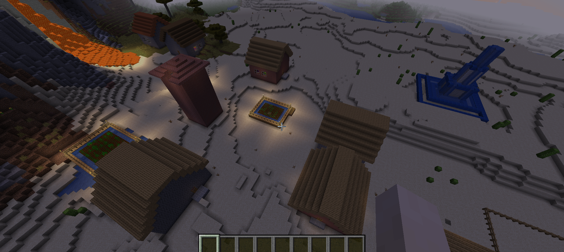
There was some really nice stuff in this generator. I liked the buildings a lot – a clear aesthetic commonality but also some nice differences – and the fountain and gardens were a really nice touch. The house interiors were nice, although I noticed an empty paddock or field here or there, and a few parts of the generator didn’t seem to have perhaps fully created what they were supposed to create? With all of that said the central tower was a standout for me, the visual style is pleasant and the interior worked nicely. To build on what’s already here I’d love to see some roads connecting areas up, since these buildings are presently all disconnected. That is of course not inherently a problem especially in a smaller settlement, but roads are often a very good way to “fill up” the space between buildings, and more generally to give a sense of connectivity about an entire generation.
Entry #12:
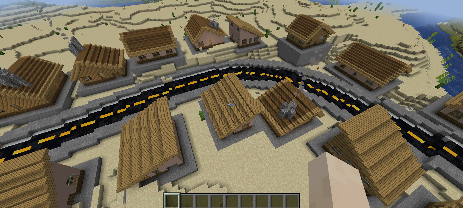
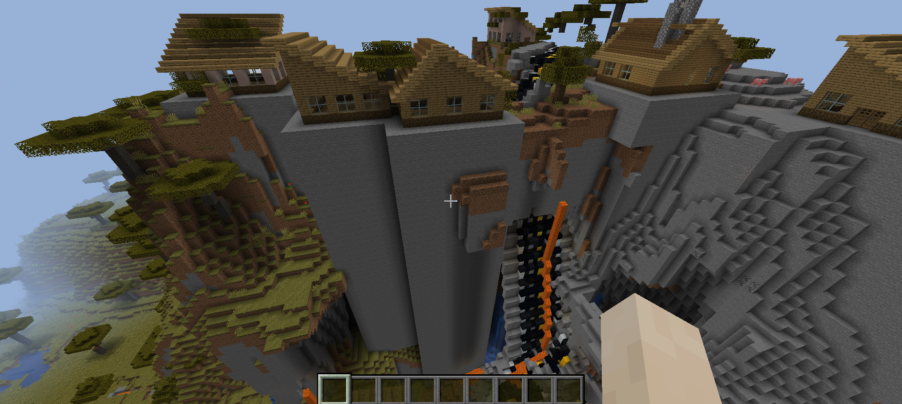
This generator was really original and fresh – I loved the roads! The roads were the real stand-out here for me, although one section of road really struggled with going up a steep hill (although hills are something lots of generators find tricky to resolve). It was nice to see another generator going for a somewhat more modern look and the roads were obviously a central part of this.
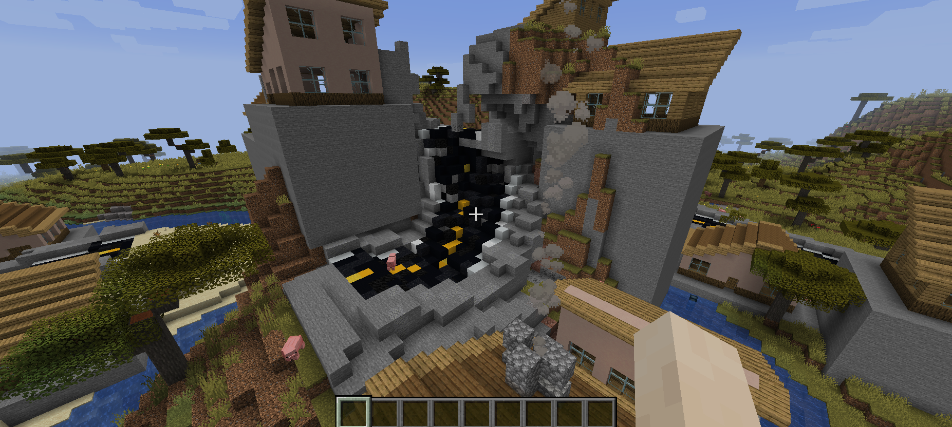
The houses were nice and varied and slotted in pleasantly along the roads, and they were similar enough to clearly belong to the same architectural style while also varying in their size, rotation, and features. It was a shame not to have anything in the interiors – but this is obviously the next thing to add to further improve this generator! Another question arose with the bottoms of the buildings: although I understand the reasons for the concrete “foundations” of the buildings, and this generally looked ok with the smaller buildings, the larger buildings or those trying to build into a hill often wound up with large foundations that made these houses look unusually prominent or peculiar compared to the others in the generation. Nevertheless, this generator was bold and different, and I really like its core idea a lot – very different and fresh.
Entry #13:
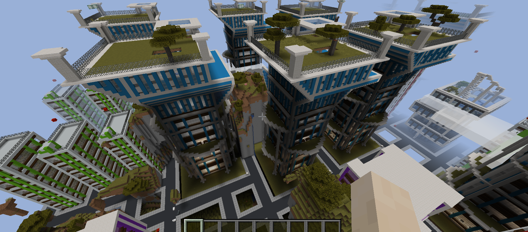
Now *this* one is different! This is a hugely striking generator, very different from most of the others in the competition; I really appreciated the attempt to design a more “modern” city than the standard archetypal quasi-medieval thing. The designer’s creative use of materials (e.g. for the “road”) is really nicely done and it’s clear when materials are representing what they “really” are in-game, or when they are representing something else. There’s even writing on the buildings! The different floors work well though they are generally fairly empty, and I did encounter enemies that were wandering about inside a couple of the buildings too. The road network is mostly logical and generally avoid the weird loops you sometimes get when generating roads, although a few loops did appear (although in a more “modern” setting, perhaps these are simply roundabouts??).
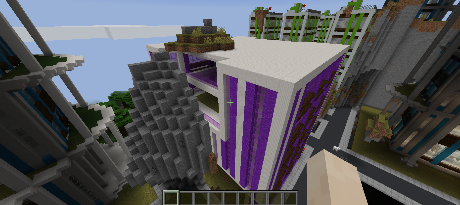
Buildings had a great range of sizes and colours and there are several architectural styles here – I loved the rooftop gardens! A lovely touch and a really nice way to almost add a “small” generator within a “larger” one – this is something I like doing a lot in my own work and I think it worked extremely well here too. This generator was all creative, bold, and impressive. Inevitably perhaps the only issue is that the generator hasn’t really done anything with the map as presented; while a few sections of the existing world poke through in some places and these large hills and the like do seem generally to have disabled buildings spawning, the overall city design is very much placed on top of the world, rather than intermeshed with it. Nevertheless, though, this is only one criterion on the judging list: aside from that this was a really, really impressive generator, and a pleasure to look around.
Entry #14:
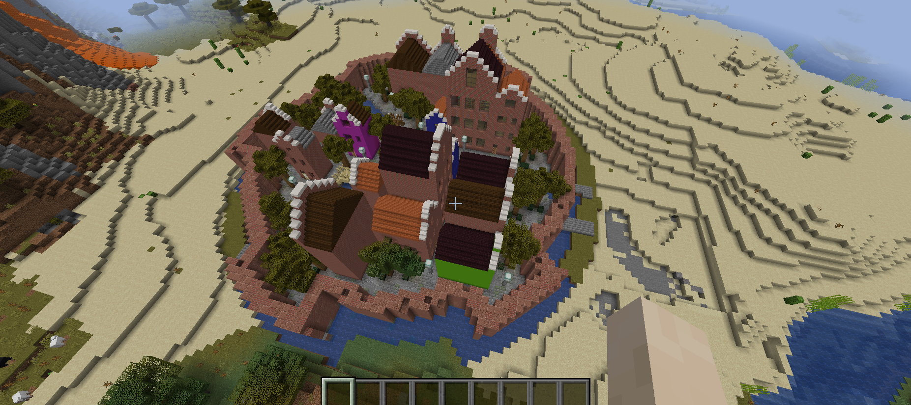
This one generated a really beautiful little walled town. I loved the interior; the use of colours for the various structures and bridges worked well, I liked the moat, and the interiors were varied and generally made sense, although I think a few things were missing from some, e.g. beds on upper floors. However, I wonder whether the generator specifically chose a fairly flat and nondescript area to spawn its stuff in, or whether the generator got “lucky” by not choosing an area with a lot of z-axis stuff to deal with? And in turn, I don’t think anything within the generated area took account of the land it was building on, so although it created something lovely I think it would have created something very similar elsewhere. Indeed, although I only marked the Volcano one I checked the Hybrid version and the generations did seem very similar, although colours of buildings and heights seemed to vary. Overall this generator had a lovely amount of detail, but seemed quite “handmade” on the procedural-handmade spectrum – but with more variety and engagement with the surrounding world, this one could create some really beautiful and interesting spaces.
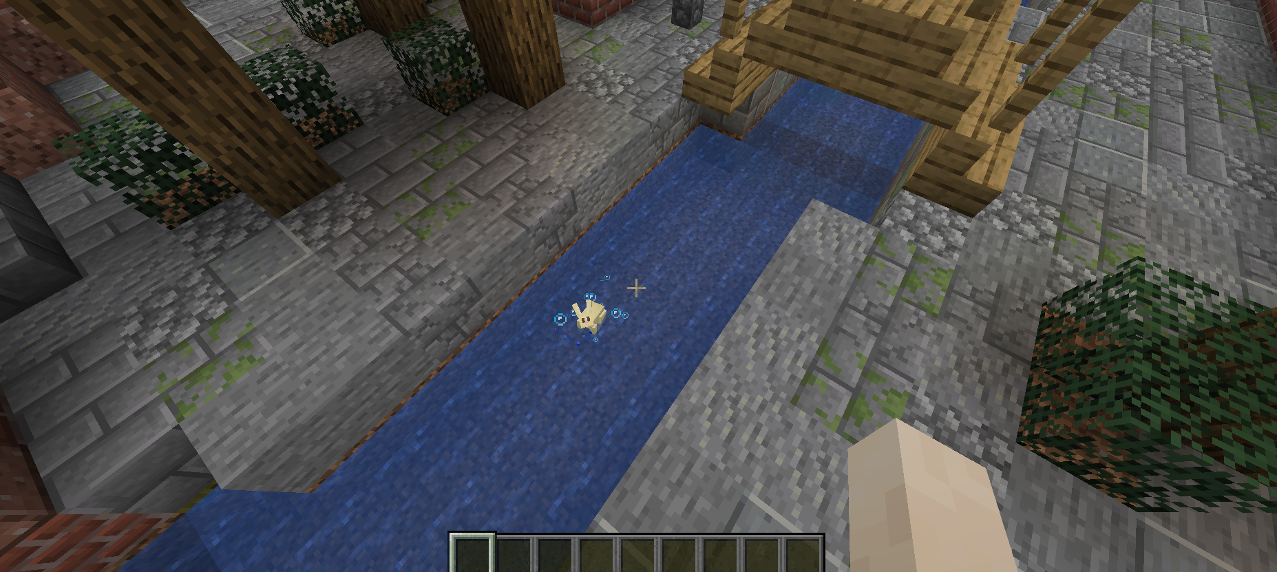
There was also a rabbit in the moat, and unfortunately my knowledge of Minecraft was insufficient to save it; this heinous failure shall haunt me forever.
Entry #15:
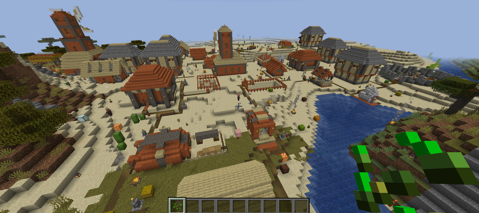
This is an absolute stand-out entry in this year’s competition, maybe my favourite (although there are a couple of other close competitors, and I’m sure it’s obvious which those are from my comments). Everything here was simply excellent, and this really stood out as a settlement that in many ways genuinely might have been created by a human rather than an AI. The generator placed buildings intelligently and sensibly, and the buildings themselves were varied and pleasing, AND generated indoors as well as outdoors! Architectural styles were consistent enough to give a clear sense of how these people like to build their homes, while not being so “narrow” that one cannot have a lot of varied buildings, and some suggestion of different buildings with different sorts of specialisations and purposes.
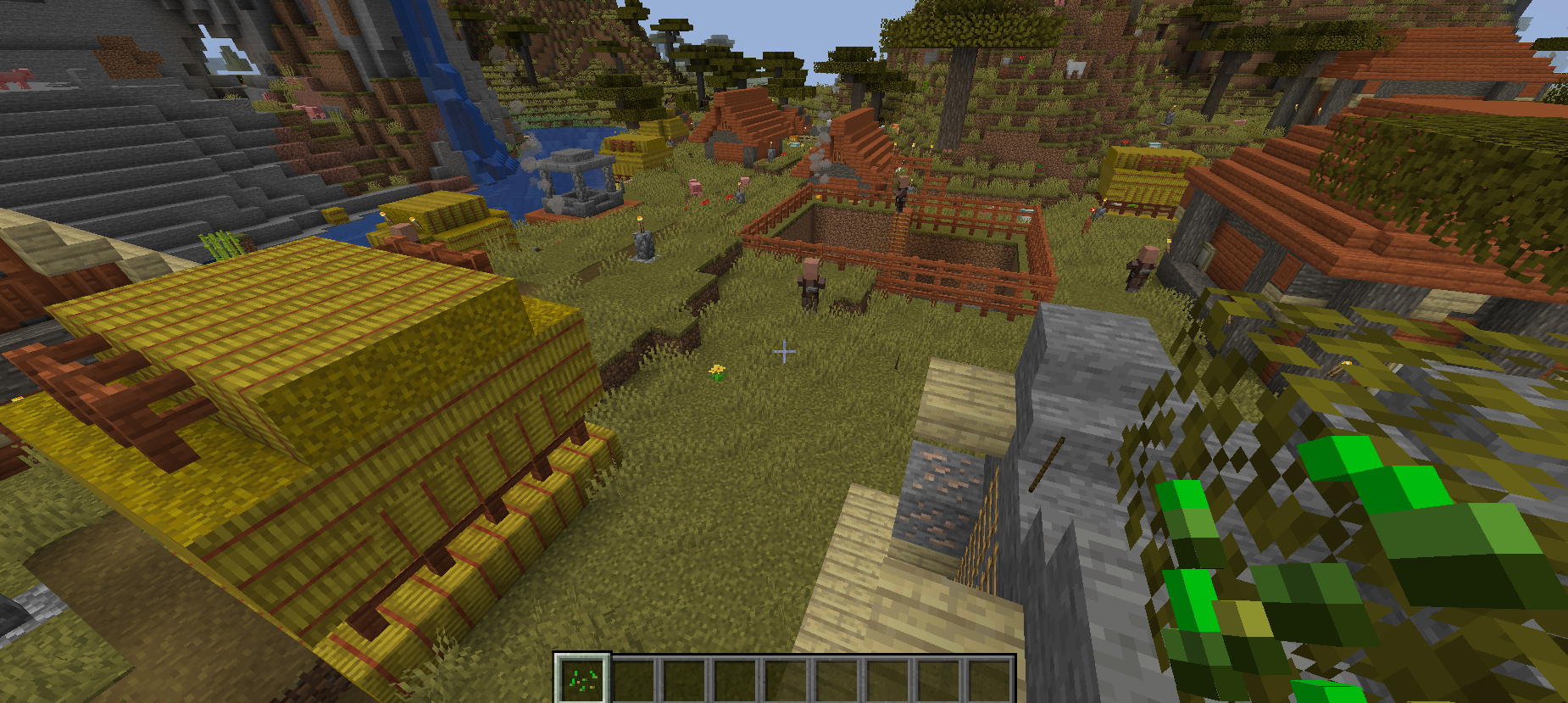
The inclusion of the NPCs was again tremendous and really brought the space to life, and the insides of buildings were varied and interesting and appropriate. I absolutely adored all the things this generator creates which others don’t, as well – there are what I take to be jail cells, for instance, and even mines with people manning them! This was a really great piece of work. It also doesn’t try to drill into the mountains and volcanoes, although one building was too near a lava flow and burned to a crisp while I explored the rest of the world. There is just so much variety here, so many implied stories, and it so well captures that balance between uniformity and difference. Fantastic stuff, I cannot wait to see a future version of this. This one honestly blew me away.
Entry 16:
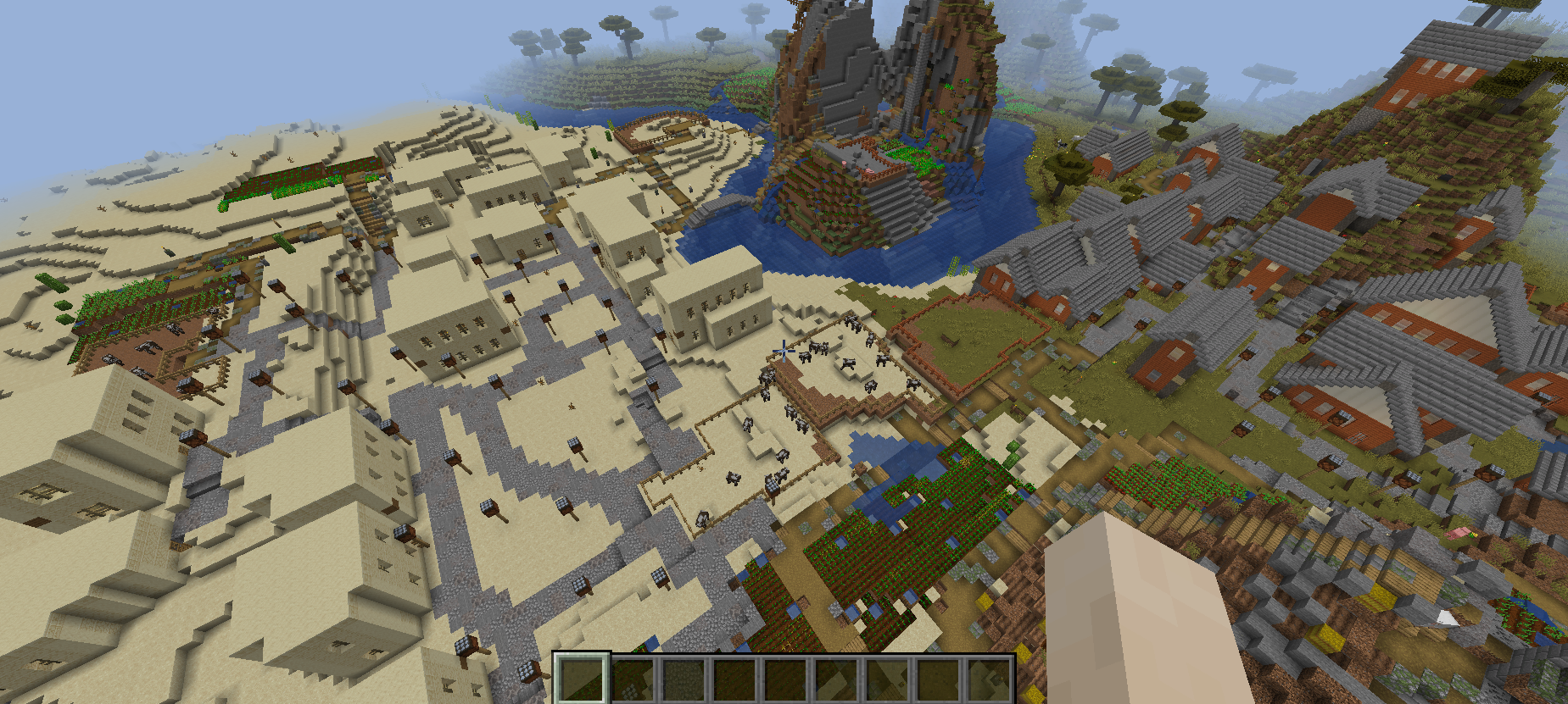
This one was, also, excellent. In a sense there were two generators in this entry, it seems, one for a more kind of “European” look and one for a more “north African” look. Both are well developed, very different, and both have enough similarity between buildings to make the aesthetics clear while also having enough difference that the structures spawned by the generator are not all simply identical. The roads were very good and generally avoid the issues with loops and so forth that procedurally-generating roads often created, and the farms also worked well. Both settlements looked very convincing and integrated well with the surrounding terrain, and as far as I can tell never tried to drill their way into the volcano and so forth. It’s a shame the interiors didn’t contain much right now – but this is obviously the next thing to work on! The exteriors were really gorgeous, though, and the combinations of roads, buildings, farms and gardens all work extremely well. This is a really nice piece of work, and I’m excited to see more development.
Entry #17:
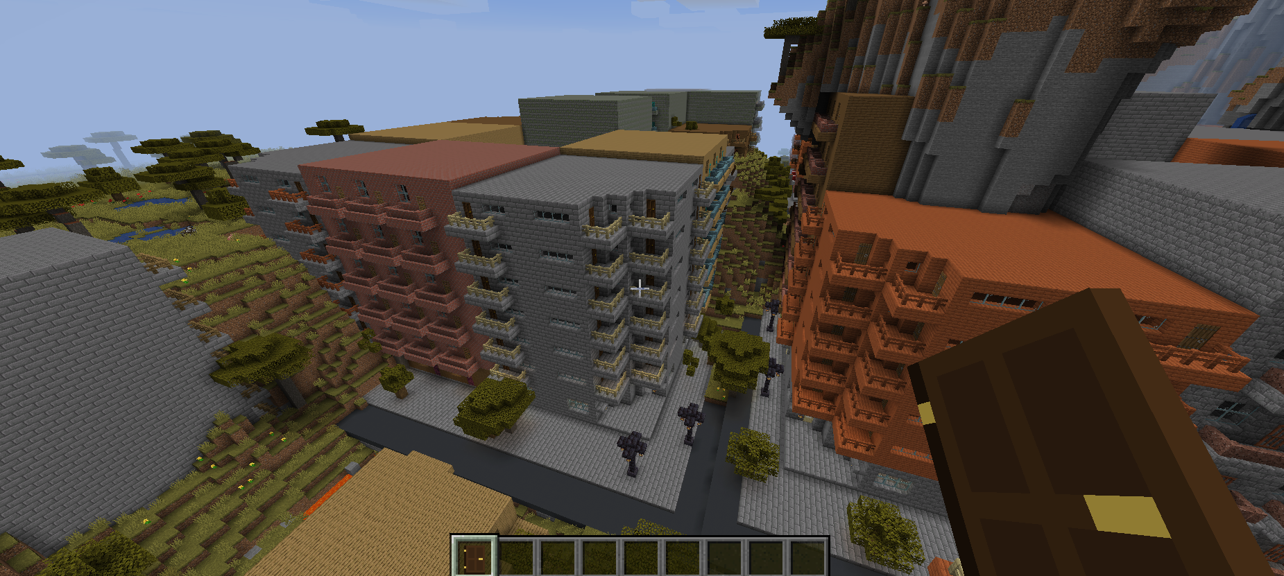
This generator was really original and different, and another one that moved away from the standard quasi-“medieval” aesthetic and instead, in this case, went for a universe full of apartment blocks. Whereas the previous blocks-of-flats one for me evoked a very modern city, maybe a Singapore or a Toronto, this one for me evoked more like Florida, or perhaps somewhere in California? These structures were really pleasing and a pleasure to explore – there were different colours, shapes, sizes, and we even had doors leading onto the balconies, which was a lovely touch (and definitely strengthened my sense of where in the world this kind of building would be found). The overall layout in these 3×3 blocks of blocks (as it were) was fine but could definitely be varied more, and they did struggle to deal with the terrain above them, with that terrain generally just being dumped onto of the block of flats. In general this generator definitely “did its own thing” irrespective of the terrain as a number of the generators did, and although more flexibility would definitely be the direction to move in with this generator, what it does generate was great. (And adding interiors would be fantastic too). Despite its imperfections I really liked this one for its boldness and difference.
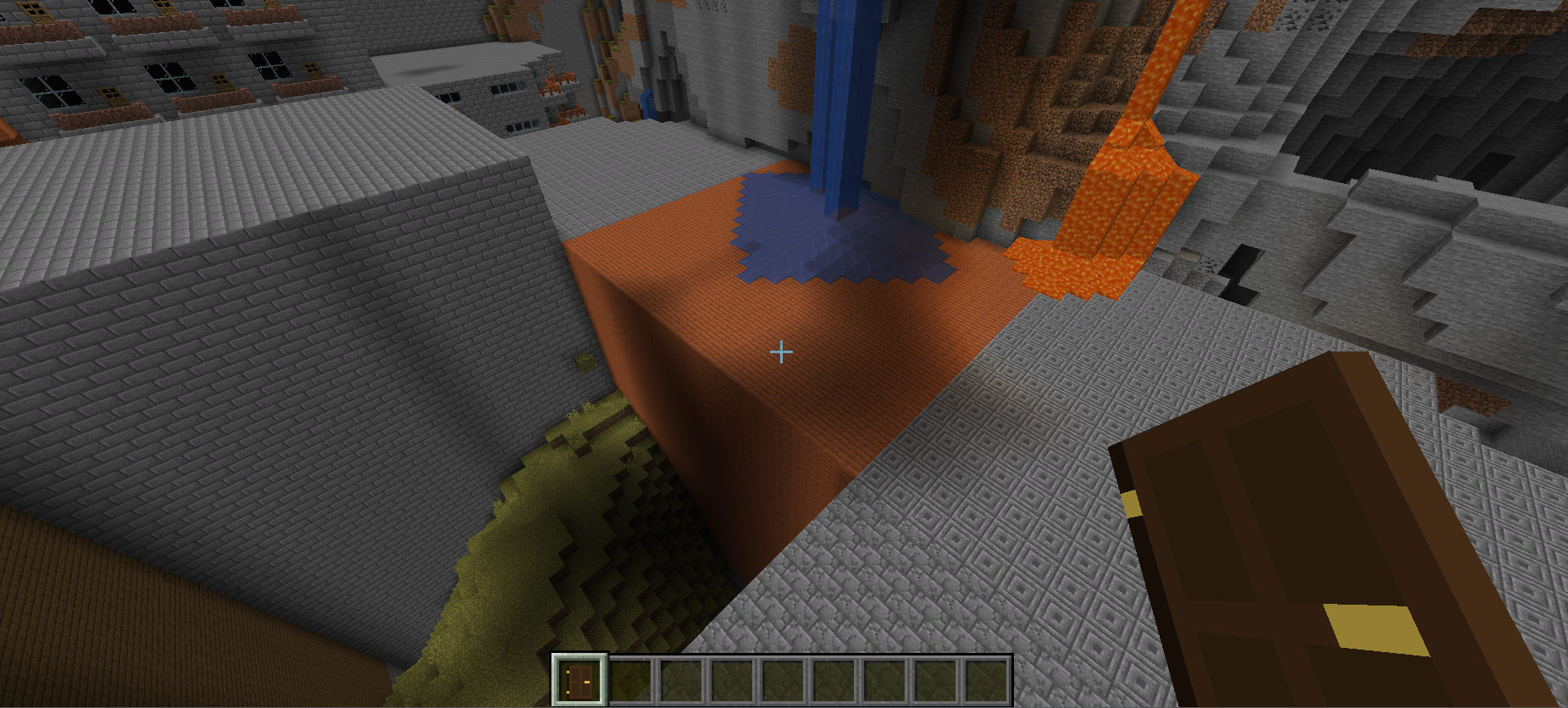
I am, however, really glad I don’t live in that particular block of flats.
Entry #18:
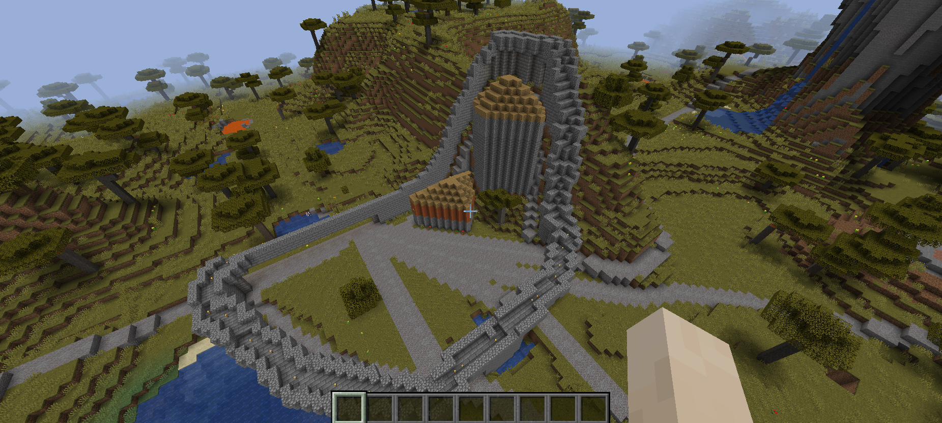
The wall in this generator worked nicely (although I think it struggled a bit with the hill it generated next to) and the buildings were interesting shapes, but unfortunately the settlement wasn’t much fleshed out beyond this. I do, however, like the roads stretching off into the distance – there’s definitely potential here for a generator exploring distantly-related settlements! Although I didn’t review the Hybrid ones, it looks like this one worked far better on the hybrid map? Based on that one this generator has a lot of promise, but unfortunately it didn’t show on the volcano map!
Entry #19:
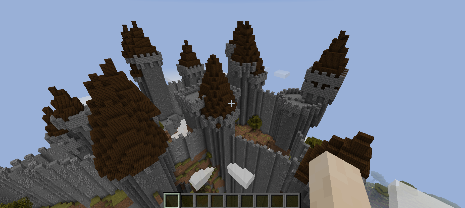
This generator gave me a very nice shock when I first opened it – I wasn’t expecting a castle atop the highest parts of the map! The castle walls are gorgeous, likewise the ramparts, and for the most part I think it interreacts well with the map; some walls are shorter, some are longer, and while some of the longer walls are definitely unusually long, they don’t necessarily look out of place. However, it was disappointing not to see stuff inside the castle walls, a definite missed opportunity. When one peers inside the walls you just get grass, flowers, pigs and so forth, and no hint of what might be going on inside the castle walls. I think the generator here is really interesting (and very different from what we mostly see in the competition) and I’ve love to see this generator tackle the insides of the castle, as well as the exterior.
Entry #20:
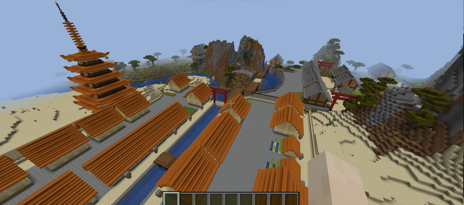
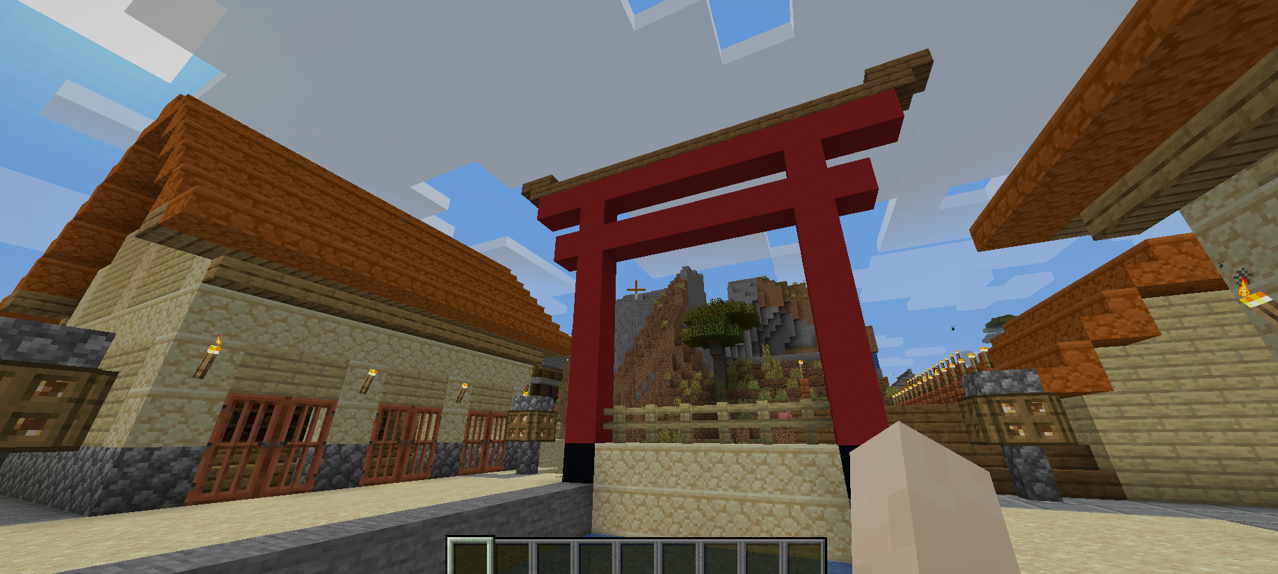
I thought this was one was absolutely great. The different aesthetic – a more east-Asian visual and architectural sense to the buildings and indeed the layouts of those same buildings (given the presence of the torii I assume this was going specifically for a Japanese style?) – really worked well, and helped this generator stand out from some of the other candidates. The pagoda and the shrines were beautiful, and so distinctive, brightly coloured and really nicely integrated with the rest of the generation. The houses were again distinctive and different and it was great to see that they had stuff inside as well as their distinctive exteriors. The bridges were gorgeous and I appreciated the more “paved” area, even if some water was flowing onto it from above! The inside of the pagoda was sparse but actually worked well, especially when one looked up into the concentric rings of the floor above. The “hall” (?) building was great as well. Overall I really liked this one a lot; bold and different and very pleasing, and decently integrated with the existing world, even if much of it was paved over!
So, where now?
Judging the GDMC this year was an absolute blast. The quality and the number of entries has climbed impressively from when I last judged in 2019 (six entries?) and there were quite a few that, as you can see, I thought merited some very high praise indeed. The top level of the generators in the competition were impressive, varied, detailed, and reflected serious thought given to the generators and the “sub-generators” within buildings or within smaller groupings and areas; in turn, even the generators that were at an earlier stage in development almost always offered something interesting, or different, or worth looking at a little more closely. One thing which stands out, perhaps unsurprisingly, was the difficulty many generators had with handling terrain. This is a well-known thing for generating settlements and the like in PCG (URR for instance has a lot of sneaky methods in there to avoid towns spanning over loads of z levels and the like) and this issue – as well as boosting the variation of the interiors alongside the exteriors – probably stood out to me the most as future directions for the competition. I’m really excited to see where it goes next year, and I do hope this write-up was interesting. Take care everyone, and I’ll see you for some more PCG blogging in the near future, I’m sure!
Very interesting! I didn’t know that this was a thing until now. Great work judging all of these entries with such a detailed analysis.
Thank you DL! 🙂
This is a very nice write up!
You might want to give #8 a second look — it is not exactly bugged, it is trying to build an expansive underground dungeon, instead of a settlement. There are some problems with the dungeon (not all rooms are well connected), but it even has different “strata”, and a certain sense of progression.
Thanks Claus, I’m glad you enjoyed it! Re: #8 – ohhhhh. That is interesting. I shall have to take another look. It sounds intriguing, actually, now you describe it like that!
I guess someday I will finally buy this game. It is great to see that more devs use PCG, I have a feeling that in the future PC gaming industry will mostly consist of independent devs and they will rely more on design and sandbox/replayability then plot and stuff. Even in the FPS style maybe like No Man’s Sky and Nightmare Reaper, but I haven’t played those myself, just read about them.
P.S.:
R.I.P. river rabbit :’c
I know, poor river rabbit 🙁
I actually had never bought Minecraft, I don’t think, until I became a judge for the competition. I’d seen a fair few YouTube videos and Twitch streams and the like, but it wasn’t really a game at the forefront of my mind; I definitely now appreciate the game a lot more than I did before! There’s some interesting and impressive stuff in there.
Thank you for your positive comments on #20. The Japanese-style structures were inherited from our generator ICE_JIT last year (1st place for aesthetic in the 2020 ranking). This year, however, we had some hiccups trying to blend them with buildings generated by wave function collapse, but we will give it another try next year.
For your information, below is the link to our first paper related to GDMC, a 2-page paper titled “An Aerial Cinematographer AI for Settlements in Minecraft-Toward Their Crowd Assessment”:
https://www.ice.ci.ritsumei.ac.jp/~ruck/PAP/jia-gcce21.pdf
Hi Ruck, thanks so much for the comment! And thank you for the paper link, I will absolutely give it a look. Thanks so much for taking part in the competition, your entry was absolutely beautiful. Fantastic stuff.